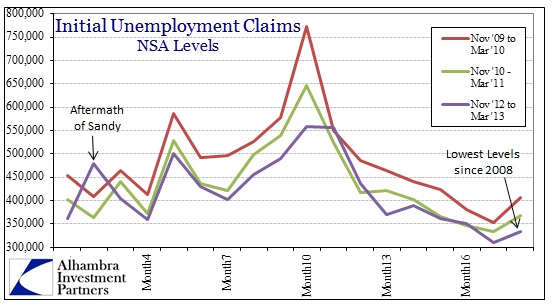
Again, better than expected data buoys markets as the tepid recovery appears not to be worse than tepid. Today the Department of Labor reported a drop in initial jobless claims that seems to confirm the employment or jobs headline from last Friday. Low initial claims do tend to correlate with rising employment levels, so it is appears to be plausible that the recovery remains in place.
A comparison of trends in the past three years conforms to the recovery interpretation.
The current trend, taken in the context of the past three years, appears to be the right direction, but if we view initial claims in a different context we see that they tell us very little about the direction of the economy, in particular the jobs market. At best, claims are coincident indications.
As the above chart shows conclusively, the current track of initial claims is identical to the track seen heading into the Great Recession. Therefore there isn’t much about initial claims that can provide a basis for determining where the economy is headed. It can be said equally of initial claims that we are currently in recovery because the trend is still better after three straight years, but also that we are heading into contraction because it looks exactly the same as late 2007/early 2008.
Economists and markets continue to be focused on the bean count aspect of jobs and claims, as if the entire economic story is presupposed through the raw numbers of jobs and jobless. The depth and context of the economy requires a more thorough analysis beyond the often meaningless headline. That is particularly true now in this recovery as the economy itself has undergone a paradigm shift away from the debt-fueled housing bubble economy of the pre-crisis period.
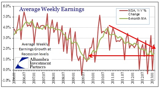
In that Friday jobs report that so cheered investors and economists, the most important number was the pace of earned income growth. Weekly earnings tells us a lot about the relative quality of jobs being produced in this new paradigm, beyond simple counts of quantity.
Here we see a far different picture than the headline figure.
Despite a turnaround in January over December, the overall reduction trend remains firmly entrenched. Weekly earned income through employment is growing at the slowest pace since the absolute bottom of the Great Recession. While the overall numerical job count advances (even here it is at best tepid and nonconforming to the traditional recovery pattern), these are not the best paying jobs.
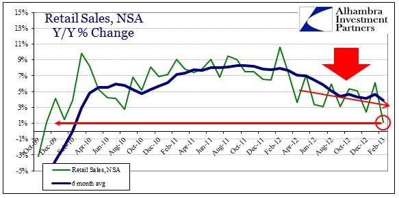
The lack of quality in jobs and the attendant slow pace of income growth eventually seeps into the rest of the business side of the economic equation. Retail sales have been showing a slowing trend not at all dissimilar to earned income. In fact, the pace of income growth leaking into slowing retail sales provides the context for analyzing the economy (building upon the overall context I laid out last Friday).
Seasonal adjustments provided a much different spin on the overall pace of retail sales in February. In the raw, non-adjusted numbers, February 2013 was the worst month of the entire recovery period. The downward trend established in early 2012 seems to have broken decisively lower. Some of that is likely a shifting of sales between January and February, but taken together the pace is now less than tepid.
While the downward cycle of employment into lower quality jobs helps explain part of the trend, the timing of these two patterns shows that there are additional factors to consider.
Again, the focus on initial claims is misplaced not just for the series’ inability to provide clarity on economic direction, but because it is the wrong series entirely. Continuing claims give us far more depth to the economic context.
To provide scale here, we can start by analyzing the changing character of jobs-related income sources from the outset of the Great Recession.
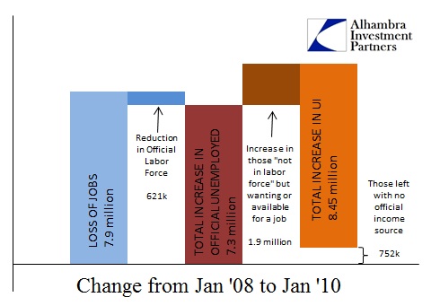
As we all well know, job losses from the onset of contraction in January 2008 were immense. According to the current BLS estimates, about 7.9 million jobs were lost between January 2008 and January 2010. However, because there was a slight reduction in the overall “official” labor force of 621,000 workers, the total number of “official” unemployed persons grew by about 7.3 million. That in itself was an immense change.
But the BLS “official” stats are not the full context. There were an additional 1.9 million people who stopped being counted in the labor force during that period that either “wanted a job now” or were “available for a job now”. These were likely people that had been working but had been laid off. Because of the methodology of collecting the BLS Household survey, they did not count in the official unemployment stats but were certainly impacted in real economic terms as they lost earned income opportunities.
If we put these unofficial people wanting or available for a job together with the official unemployed, the overall increase was an astounding 9.2 million people. Fortunately there was at least a safety net of unemployment insurance that provided government transfers for 8.45 million of those. That left about 752,000 people without any ongoing sources of income.
In the context of the pre-crisis transition into the Great Recession, the safety net was no substitute for relatively high-paying jobs and the usage of credit in consumer spending. It was a tremendous downdraft of income sources that reflected out into the broader economic parameters.
On the other side into the recovery, we should expect to find the same pattern in reverse – growing jobs and less safety net usage. Indeed, that is exactly what we find, but the pace and scale of each is far of proportion.
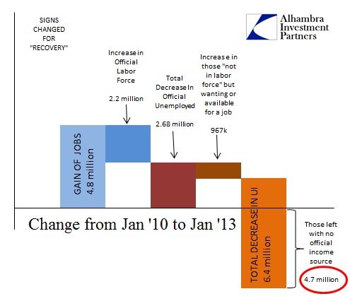
From January 2010 through January 2013, the economy gained 4.8 million total jobs (setting aside the implications of quality). However, 2.2 million of those jobs were absorbed by growth in the “official” labor force. That meant a disappointing decrease in overall “official” unemployed of only 2.68 million. But, as has been noted through declining participation rates, those not in the labor force have increased to record levels.
In our calculations here we are only using two categories of those not in the labor force, meaning that we are not even capturing the full extent of the participation problem. But for our purposes the inclusion of only those “not in the labor force” but wanting or available for a job keeps the focus on the sector of the population that are most affected and most need some source of income (either earned or transfer). Over the recovery period denoted above, this segment increased by nearly 1 million workers.
However, the total number of workers falling off the unemployment rolls was an astounding 6.4 million. That leaves nearly 5 million workers, compared to January 2010, without any source of income, tepid earnings or otherwise.
In comparison to the pre-crisis period, then, we see a progression downward: from a high degree of earned income and credit usage (before Jan 2008) to a high degree of marginal government transfer usage to an elevated state of unemployment plus lower quality jobs for those who actually found them and then nothing for the rest. The fact that the recovery has been tepid is rightfully seen in this progression of income sources. That it likely cannot remain even a tepid recovery is seen by the lack of progress on wages and the increasing number of those falling off UI rolls into nothing.
The real economic story is deeper than the headline and absolute counts of the number of jobs or unemployment claims. It’s not a pretty sight – the economy, given this income progression, appears to be still in the process of shifting paradigms. Structural changes of these kinds are messy and often economically violent. I see very little here to celebrate as real optimism.



Stay In Touch