
Continuing on with the theme of orthodox interpretation vs. context, in order to determine not just the relative position of the economy but how that relates to “markets” vis-à-vis bubbles, the current estimates of personal income and spending fit well within those rough confines as I have described them. The orthodox interpretation sees the changing growth rates in 2014 as significant, especially income and especially its relation to the atrocious figures (heavily revised) from 2013.
Indeed, DPI estimates in this part of 2014 have been “better”, which is, of course, a relative judgment that may or may not hold any meaning itself. As with physics and Einstein, economics (true, not textbook) exhibits a universal relativity that is all-too-often discarded or forgotten. In other words, incomes may be better than 2013, but that isn’t saying much. It is, however, interesting that though 2013 is now figured to be highly negative for income nothing much was said in that direction concurrently. Instead, as now, the mainstream convention was for “recovery” regardless of what actually transpired.
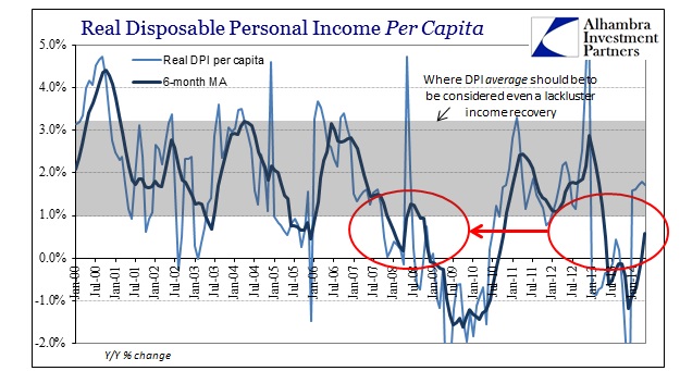
Not only do we have the re-appearance of the trend from 2006-08 showing up post-2011, actual and wider context demands re-assessment of what is taking place. Viewing income growth through proper context shows that the difference between 2013 and 2014 is actually trivial, and that deficiency is the only qualifier that applies in both places.
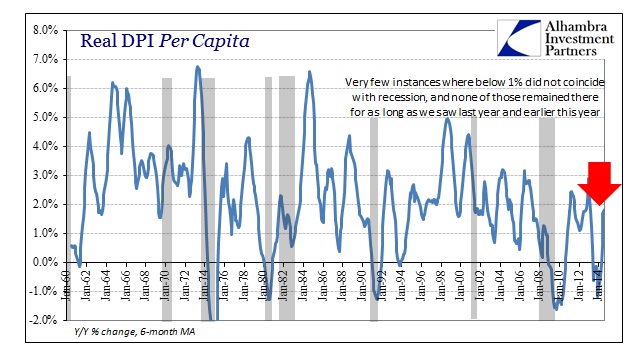
There is a lot that is revealed in the chart above, not the least of which is the lack of potential for economic activity, i.e., spending in this context. Income is the predicate position for spending, even under circumstances where monetary authority wishes to be highly supplemental toward debt “filling in the troughs.” The basis for economic advance is still wages, and that is the entire problem this century.
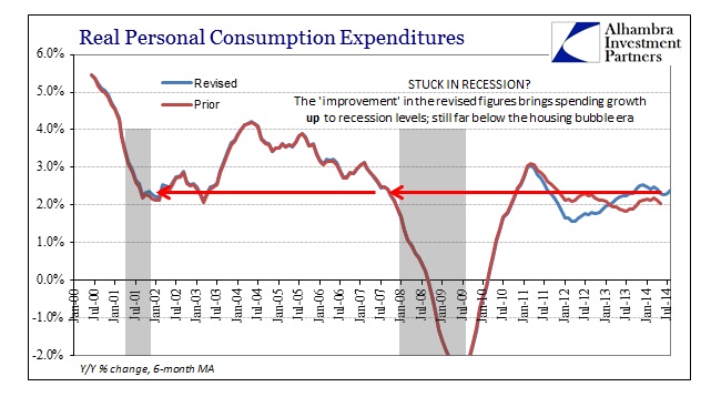
The “recovery” as it exists now has not exhibited the same kind of “volatility” as seen in the past. In other words, though the lowest point was the lowest seen in almost eight decades, there has been no symmetric high point off the low. Even the revised spending figures (shown above) are “better” in terms of 2014 vs. 2013, but so what? Going from really bad to mostly really bad is not an achievement of any kind, and it suggests more about the lack of actual growth than a solid foundation for reaching “next year.”

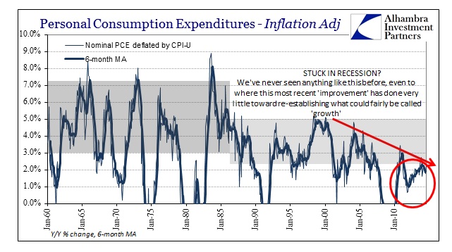
The current “rut” of spending is highly conspicuous on a nominal basis, which suggests why so many economists are enamored with more “inflation” or NGDP targeting. While, in some respects, the idea of comparing nominal growth in spending is misleading due to estimates of “inflation”, that is far less so when looking at recessions (where “inflation” tends to be absent). Again, it is very conspicuous that this most recent “improvement” in income and spending has done nothing to raise the level of growth above what other recessions showed as a trough.
Even accounting for “inflation” does the current year no favors. Using the CPI to deflate nominal PCE produces the same defunct pattern as I have stated throughout.
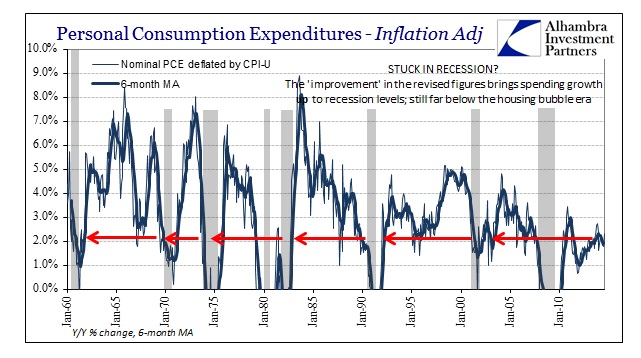
Adjusting (badly) for price changes, the current track of spending is about even with mild recessions of the past (which makes a loud proclamation about the publicly assured “recovery” in 2012 by relative comparison). This is a unique period in economic history, where the level of upward attainment has been so lacking; stuck at the bottom as it were.
We can be more precise in our estimates of “lacking” too, whereas there have been clear changes in economic results marked back to around 1985. In the case of PCE, the difference, at least outwardly, conforms to the orthodox interpretation for what it itself has proclaimed as an achievement through activist monetarism (mostly in the form of interest rate targeting aside the “evolution” in the eurodollar standard). The economy was far more volatile prior to 1985, as is clear above. However, in achieving less volatility, that has meant lower high points, now increasing in their shrinkage since the late 1990’s.
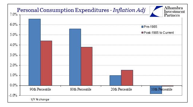
The argument in favor of reducing volatility is that the net effect of all that (filling in the troughs) will be fewer instances of “bad” economic times. In other words, there may be less at the high points, but there is supposed to be higher low points, and fewer of them.
But that does not appear to be the case. In terms of spending, clearly the economy has downshifted at the highs but has not gained much of the lows. Prior to 1985, 60% of the time (monthly) inflation-adjusted PCE was between 5.6% and 1.0%; after 1985, including up to the latest month in 2014, 60% of the time the economy saw between 3.8% at the upper bound and 1.5% at the low end. We lost 1.5% growth at the top to gain only 0.5% at the bottom. The disparity widens further when examining the difference between the 90th and 10th percentiles.
Bringing in the current “recovery”, however, shows just how much this current period has malformed to an even greater degree.
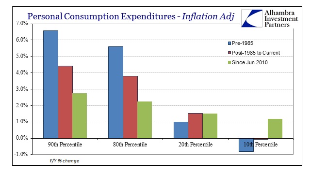
The economy loses even more at the tops, but only gains in the extreme situation of the lowest points. In other words, the economic “cycle” has become far more elongated and less likely to feature actual strong periods. That is a huge problem, particularly as compounding and time is a major feature of the real economic landscape outside of classroom theory.
This deficiency is actually more pronounced in income than spending, though of the same pattern as you would expect since the income and spending are, again, very closely related.

Here, though, there is no “benefit” at the bottom as the “recovery” has shown no tendency toward higher low points; rather the lows are actually worse without attaining any of the upward potential that was “available” in either period. That is truly frightening and depressing (both as a state of mind and in economic terms). Maybe there is something to this “Lesser Depression” after all, though the data here more than suggests a starting point long before 2008.
Does it matter if current levels of spending have moved from pretty recessionary to just recessionary? The fact that growth remains stuck here again suggests not just the absence of recovery and the low probability of it actually showing up, but rather a very strong and dangerous structural issue that relates to elongated “cycles” without any significant peaks. Another instance whereby we see clearly that “someone” has shaved off the peaks, except we are left to wonder what was actually gained by doing so.
Volatility in the economic accounts and even the business cycle were supposed to be “bad”, but give me that any day as it was a far better outcome to have intermittent recessions with at least the chance of robust growth than our current construct of intermittent recessions without any possibility for even lethargy. That is a factor not just for the economy, but in factoring actual market placement and the “sudden” appearance of serial asset bubbles.
Click here to sign up for our free weekly e-newsletter.
“WEALTH PRESERVATION AND ACCUMULATION THROUGH THOUGHTFUL INVESTING.”
For information on Alhambra Investment Partners’ money management services and global portfolio approach to capital preservation, contact us at: jhudak@4kb.d43.myftpupload.com
Stay In Touch