
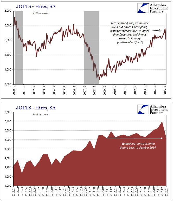
The latest JOLTS update finds total hires in January down by a rather large 372k, leaving the monthly seasonally-adjusted rate at still 5 million. Given that the estimated hires rate increased unusually in December, it seems as if January was the statistical catchup or seasonal give-back. That leaves intact the same sideways pattern that first appeared around October 2014.
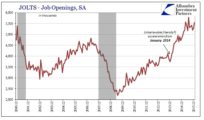
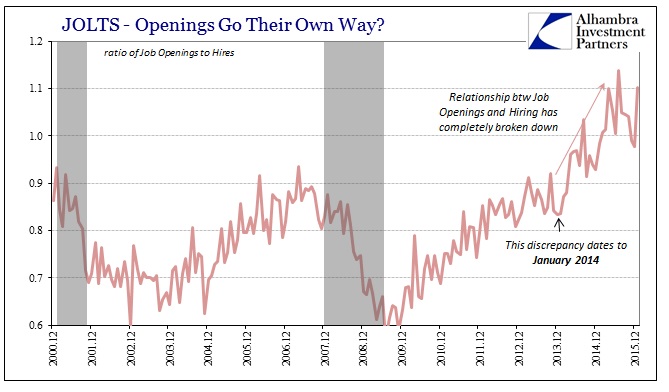
Throughout last year no matter how drastic market behavior or the growing manufacturing recession, it was Job Openings that seemingly provided the statistical spark for continued optimism and enthusiasm about potential labor market strength (not factoring that the CES is itself embedded as a statistical “check” on JOLTS figures). In reality, the Job Openings figures just went insane, leaving behind all other correlations that would corroborate the narrative – especially Hires.
Since summer, the acceleration in Job Openings has disappeared though the level remains historically detached. With the suspicious rise in the labor force during those months, it seems to add more evidence to the unusual “coordination” on those accounts which seem to follow the theoretical model of the Beveridge Curve (an explanation of this contention can be found here). In other words, with the labor force not expanding through 2014 and much of 2015 the only way to keep the Beveridge Curve shape was to sharply increase estimated Job Openings to keep up with the rapidly falling unemployment rate. Had the labor force grown alongside purported jobs, the unemployment rate would have declined more gently meaning Job Openings would have been able to maintain those historical associations.
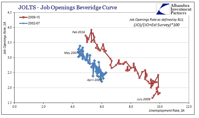
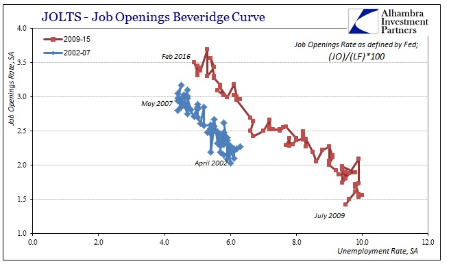
To be clear, I am not charging that the BLS is making up numbers to fit any agenda, preconceived or otherwise, more so that the current labor market defies all past and historical experience, rendering these sorts of statistical processes literally “out of their elements.” That is most especially apparent in the realm of the apathetic labor force and the continued exclusion of millions from the official figures. The whole point of the Beveridge Curve was to check the labor numbers by way of common sense – that a rise in advertised job openings (labor demand) should lead to a similar and predictable rise in labor participation and utilization.
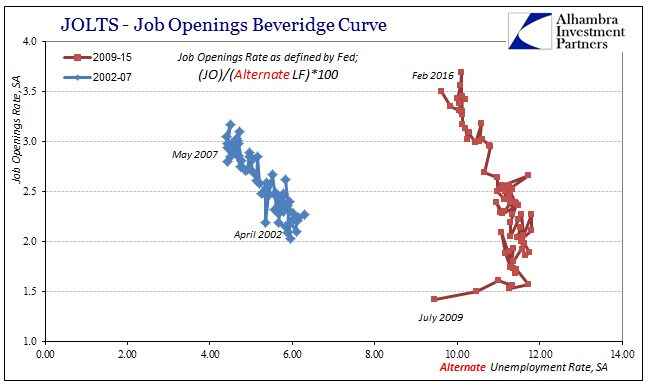
It is only with the skew of the published unemployment rate that that relationship is maintained. Factoring in more historical levels of participation shows no relationship whatsoever between published Job Openings (a calculated rate) and the alternate unemployment rate that includes at least two thirds of the “missing” 15 million.
If, however, you go the other way and hold Job Openings constant to the October 2014 level, similar to what we see in Hires, then the Beveridge Curve breaks down horizontally.
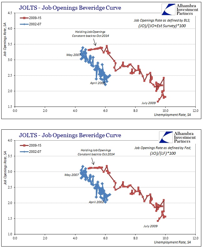
In other words, Job Openings “have” to surge in order to keep up with the rapidly falling unemployment rate even though it doesn’t match orthodox theory on any other count. That is the big problem with the labor statistics, most especially the unemployment rate, as it “forces” too many other accounts to adjust to a view of the economy that can’t be found anywhere else – including policymaker’s models. If you believe the unemployment rate an accurate measure, over-emphasizing trend-cycle components might result and result in other correlations being drastically overrun (such as Job Openings to Hires, or retail employment to retail sales).
On that count and the estimate for Hires in January, it seems the labor market is still rather unchanged from October 2014. That view might apply to both the overall labor market as unenthusiastic since then, as well as in terms of heightened suspicion about bias in the data that is supposed to aid in that assessment.
Stay In Touch