
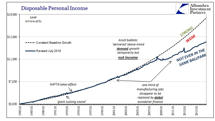
Personal Income and Spending continue to suggest only further weakness. While there is a whole lot of caution necessary when analyzing this data due to its susceptibility to large revisions, there is still only further deceleration on both sides of the consumer. Nominal Disposable Personal Income (DPI) was up just 3.4% year-over-year in September 2016, below the 3.8% average of 2015 and the 3.7% average so far of this year (including September). DPI averaged 5.5% from 2003 to 2007 and 5.7% from 1992 to 2000. What should be truly concerning is that nominal DPI averaged 4.0% during the worst parts of the dot-com recession, October 2001 through September 2002.
This low rate of nominal income growth only adds to the further cost of how the Great “Recession” wasn’t a recession. DPI “should” have been slightly more than $18.4 trillion had the dislocation in 2008 been an actual cyclical disruption. Instead, DPI is only $14.1 trillion in September 2016, a huge disparity that the real economy cannot simply ignore (as economists do).
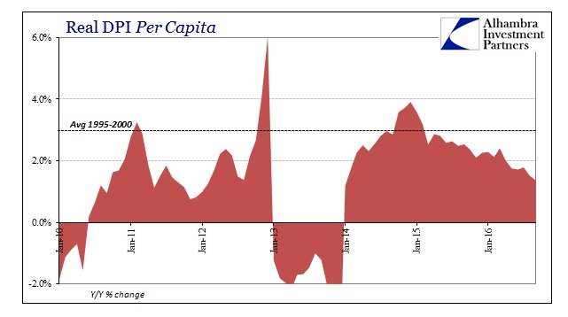
Real DPI per capita declined in September for the second consecutive month, leaving the year-over-year growth rate at just 1.4%. That is the lowest gain since the end of 2013 when the tax change in 2012 created muddied base effects.
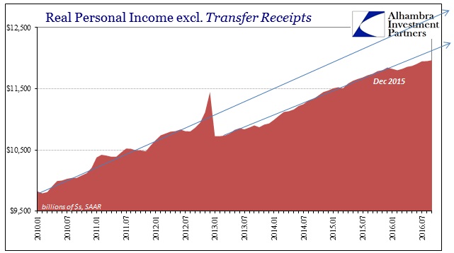
Despite the drawbacks in the data series (again, tendency toward large revisions), there is widespread indication that the “global turmoil” of last year made a real difference as far as incomes for US workers. All the income series have registered noticeable deceleration, including Real Personal Income excl. Transfer Receipts, data which the NBER considers as one of their four major cyclical inputs. I wrote in August about the situation in those four:
What was a steady growth trend, albeit, as usual, weaker than in past “cycles”, suddenly stopped at the end of last year – an inflection point that isn’t in any way surprising. It did not turn recessionary and immediately drop into contraction, but that isn’t my point with all this. I am not trying to define a recession in 2016, rather I am looking for a consistent and comprehensive view of the economy as it actually is. Using the NBER’s criteria, what we find is highly compelling weakness in three of them stacked against the fourth.
The income estimates were revised slightly higher since then, but the break with the pre-2016 trend remains anyway and further corroborating the overall weakening income environment. That means the three NBER data points (Real PI less Xfers, Industrial Production, Total Business Sales Adj. for Inflation) remain quite against the unemployment rate even though this year was supposed to be far more like that than the other three.
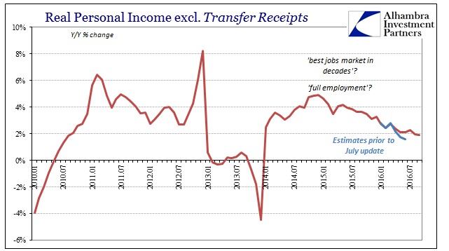
Other labor market statistics, including a noticeable deceleration for the CES and Establishment Survey, reflect what we see in the income estimates. The weak economy of 2015 was no aberration, an interpretation increasingly set by income estimates; it was only the beginning of the next leg down in what is not a recessionary progression. This is much more than that, as it begins long before the “rising dollar.” Incomes are typically a lagging indication, meaning that this data, should it remain even somewhat undisturbed by future amendments, suggests the economy’s deceleration is serious and ongoing.
Though the PCE Deflator, like the CPI, rose to its highest rate since October 2014, at 1.25% it still shows nothing of the $4.5 trillion of the Federal Reserve’s balance sheet expansions (via QE’s and other “extraordinary” policies). In May 2014, for example, the PCE Deflator appeared to accelerate to 1.83%, predicting the same pattern as we find for inflation now. In other words, the base effects of commodity prices and weaker economy in 2012 and 2013 led to what looked like an inflation rate moving back toward the 2% target when in reality that was just reflecting the absence of further active monetary disruption.
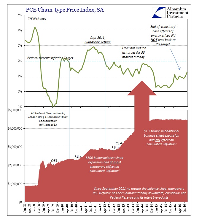
We are seeing this process repeat in 2016 where a “higher” rate is just picking up the end of the active effects of the “rising dollar” last year. If this was actual economic progress, the PCE Deflator like the CPI wouldn’t meander slightly higher, it would, as history shows, truly surge. What I wrote earlier this month with regard to the CPI applies here:
A sharp deceleration or even drop in prices, like economic output, should lead to an equal or sharper rise in prices (or output) after the weakness passes. The CPI was -2.1%, for example, for July 2009 and still negative as late as that October; but it finished the year at +2.7%, a nearly 5% swing from low to high in a matter of months. In the dot-com recession, the CPI bottomed out shortly after its end at 1.1% for June 2002. Just eight months later, it was back at 3% all over again.
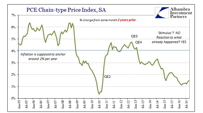
The two-year change in the PCE Deflator demonstrates the lack of economic (and monetary) momentum through the whole part of the “rising dollar” (so far). Like weaker income growth, the dearth of true acceleration in overall calculated inflation this year after near-zero last year is conclusive at least insofar as demonstrating this economic period is unlike all others. From that we can easily infer the monetary cause as well as what that means for the economy (depression, not recession); “transitory” was always just a fantasy, one that can no longer hold up, where recession wasn’t nor isn’t the actual downside case.
Stay In Touch