
For the most part the “reflation” narrative has focused on nominal interest rates. That, for once, actually makes some sense given interest rates are really at the center of all this. Stocks are whatever they are, but whether you figure the Federal Reserve and monetary policy or just the economic reflections of interest rates, the nominal world does seem to be captured by renewed optimism. In the end, a recovery will be something the bond market anticipates.
There are already enormous similarities between now and 2013, especially the bond selloff. To the UST portion of the bond market, a recovery will look it did then. Nominal yields will rise and the UST curve will steepen in anticipation of actual opportunity (and money) in the real economy. The “fear trade”, as it was once called, will definitely recede if not wholly disappear when the true recovery is just over the horizon.
Those patterns did emerge three years ago, particularly after the word “taper” was introduced early that May. What followed was a rather violent bond selloff that left the MBS market, in particular, a total mess. Regardless, the yield curve steepened as nominal rates jumped, with the 10-year CMT yield spiking from a low of 1.66% to a high of 3.04% by year’s end.
So far the nominal move in the UST market is of similar proportions in the 10s.
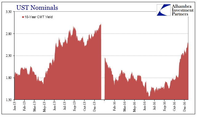
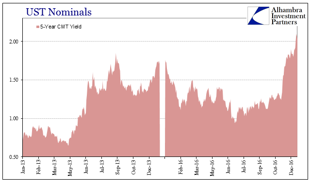
The current UST selloff has brought yields up over 2.60%, but starting from just 1.37% at the low. Further inward on the curve you go, the more favorable the comparison. At the 5s, for example, the current rise in nominal yields is far more intense than even 2013. It surely references monetary policy as the difference; tapering QE in 2013, lifting off ZIRP in 2015 and 2016.
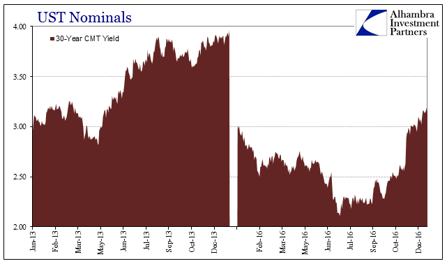
That, however, is where the positive attributes of even that past reflation end. At the long end of the curve, the long bond suggests much less enthusiasm.
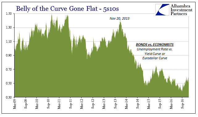
Reflation is never going to be so one-dimensional, however, as, again, there are other factors beyond the nominal to consider. More important, especially as a form of market verification of nominal yields, is the curve shape. As rates rise, the curve should dramatically steepen so that the whole complex jumps higher into what used to be normal. That might have been the most provocative part of the 2013 reflation selloff, where the curve in these two dimensions began to seriously reflect standard recovery mechanics at most points.
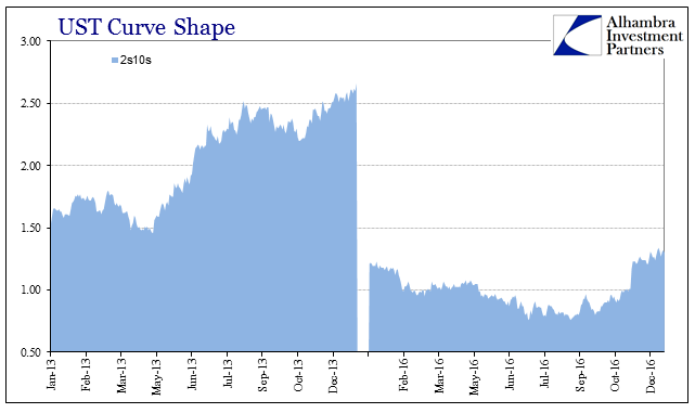
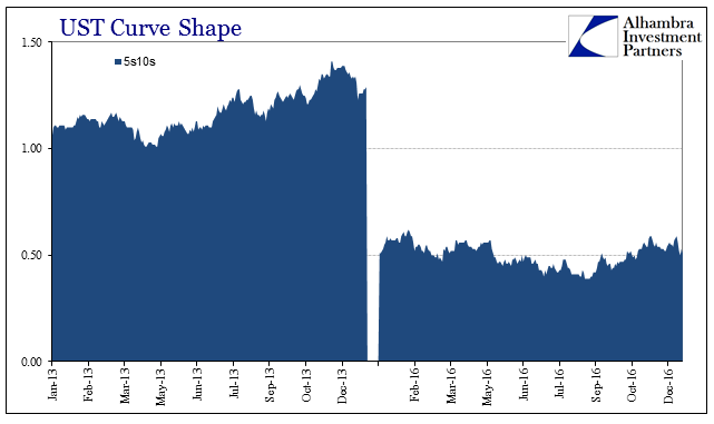
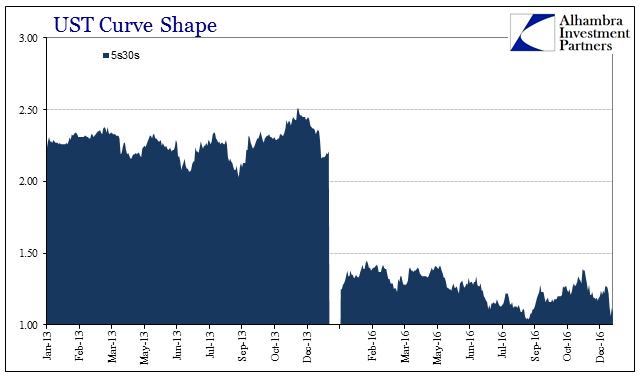
This latest market, by contrast, comes up seriously short in all those respects. Not only has the entire UST curve shrunk due to the monetary eurodollar tightening under the “rising dollar”, even in this latest selloff nominal yields are rising but the curve isn’t steepening let alone exploding. The further out you go, where the real economy is far more of a factor, the less vibrancy is indicated as to what might be beyond the short run. The 5s10s, perhaps the most important part of the yield curve overall, isn’t any steeper today than it was to start the year amidst obvious global financial, economic, and monetary turmoil.
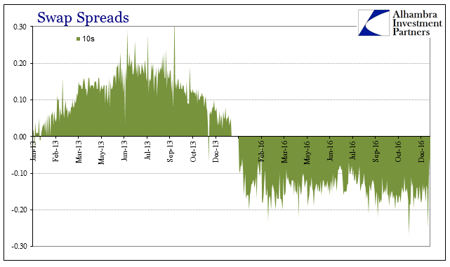
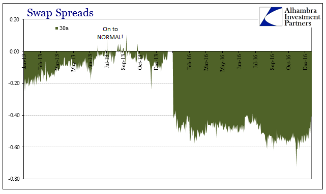
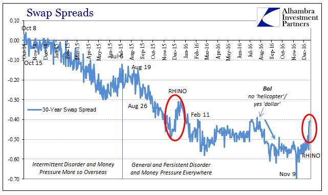
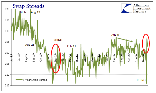
The reason for the “rising dollar” is simply balance sheet capacity, or the dwindling of it. Though we have so very few indirect measures of what constitutes the myriad factors determining “dollars”, there are a couple of market prices that help us gain such insight. Swap spreads in 2013 were decompressing after falling so very low in 2012 in the aftermath of the monetary events of 2011. Both the 10s and 30s moved up well before the UST market ever caught the reflation idea. And just as swaps anticipated the reflation, they had also suggested by mid-summer its end.
The 30-year spread actually turned positive in the middle of 2013 for the first time since falling below zero in late October 2008, a bright warning that late into the crisis that “something” still wasn’t right. As the 30s spreads punched above zero again, there was a rush of commentary, as always, to use just such an even-number boundary to push the recovery narrative. From the WSJ in July 2013:
For the first time in more than four years, a quirky gauge of investors’ expectations for interest rates has changed course, the latest signal that the U.S. markets are normalizing after the 2008 financial crisis.
That, of course, turned out to be the wrong interpretation. What we have to keep in mind throughout all of this is that we are comparing the current hope of “reflation” to the last one that was never more than hope. It was then a false positive, more like bearish hedging against the possibility of monetary policy actually working rather than a total embrace of normalization as the base case. In other words, 2013 wasn’t actually reflation.
In 2016, across these more appropriate dimensions, there is even less of a possibility indicated for such normalization. Swap spreads, in particular, are nothing like 2013, not even moving in the right direction this year so as to initiate uneducated mainstream stories about “quirky gauges” that are suddenly more ordinary looking. Instead, the media has been forced to suggest that primary factors like swap spreads just aren’t working anymore.
What else can you do with swap spreads when it comes to “reflation?” They aren’t even positive when compared just to last year’s RHINO. Monetary policy does have some effects on these markets, though not in the way that everyone thinks.
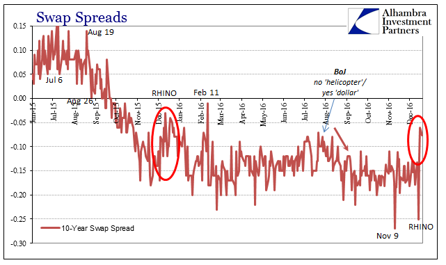
In the weeks before last year’s FOMC “rate hike”, swap spreads decompressed by some good amount across all tenors. This year, there was barely any movement in that direction until these few trading days so far after last week’s announcement. That either means swap markets were caught by surprise with the latest “rate hike”, not very likely, or they are trading on factors more central to “dollar” conditions than whatever Yellen and the empty suits were discussing.
It is perhaps a good illustration of what monetary policy actually is in any meaningful sense. In convention, rate hikes are tightening because all the textbooks say that raising the cost of federal funds increases the costs of funding in dollars for everyone. That was true at one point in the past, but over the decades as the eurodollar system expanded the idea of “tightening” (or “accommodating”) became something else altogether. We know very well there wasn’t any of that a decade ago when Alan Greenspan raised rates and the “dollar” went about its parabolic rise (“weak”) anyway.
What monetary policy has become is nothing more than a frame of reference, a shift in the nominal numbers of only some of these dimensions. And in many cases, including last year, the change in reference point proved quite fleeting. I believe that accounts for the lack of anticipation in swap spreads this year.
In another sense, it also suggests these disparities between “reflation” in 2016 and that which was more widely embraced in 2013. The whole idea of recovery has been redefined over those three intervening years. It was the bond market that took the task first; economists and policymakers are just now catching up to what fixed income markets were trading before and during the “rising dollar.” Nominal rates go up as a frame of reference for immediate prospects, but the deeper and more important indications of money and finance don’t follow.
That either means funding and credit finally understand what actually happened in 2013, when reflation was just the latest recovery ruse in a string of them going back to 2007, reluctant to join in the optimism because they know it is fleeting and the next downward lurch (or depression cycle) is bound to show up at any moment. Or, as monetary policy is attempting to describe now, even if this is recovery it is nothing like what recovery was in the past.
It is entirely possible that this current wave of positivity is just getting started, and over enough time and with sufficient confirmation (meaning more than just talk) even swap spreads will normalize. While that may be conceivable, we have to recognize and consider just how far away from 2013, let alone actual normalcy, current conditions are and the importance of that. In very simple terms, the taper summer “reflation” had some conviction to it, though ultimately not much because it never truly deserved it. This reflation doesn’t really have any at all, not even the full range of nominal let alone where it really counts.
Stay In Touch