
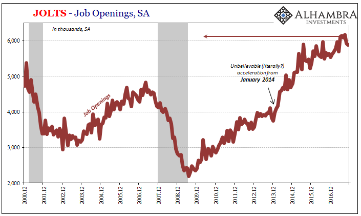
The latest JOLTS survey from the BLS suggests nothing much has changed from that particular view of the labor market. The level of estimated Job Openings (JO) while down slightly over the last few months remains exceedingly high. By contrast, the rate of monthly Hires (HI) continues to be subdued, if at the high end of its recent range extending back to the middle of 2015.
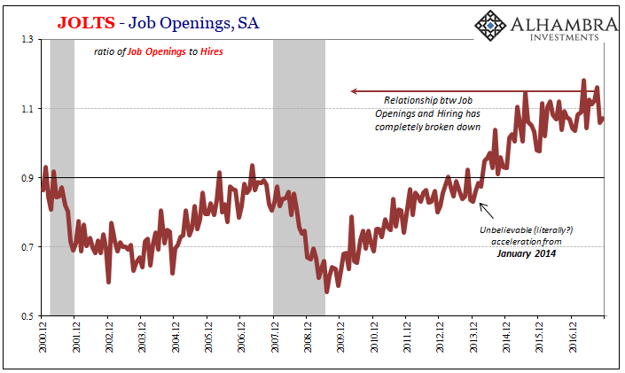
That really means the JOLTS data presents not one but two very distinct pictures of the employment environment. This is a relatively new divergence, one that opened up at the start of 2014 when JO spiked. The prior relationship that had existed going back to the origins of the series was obliterated, and though HI has come up somewhat over those almost four years in between there is still, again, wide disagreement.
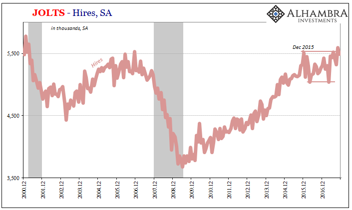
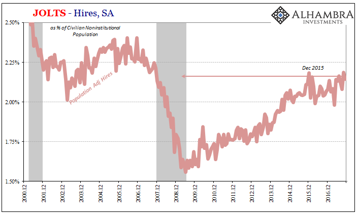
The difference is all the more glaring when we adjust for population growth. After all, the 5.5mm hires estimated for November 2017 aren’t the same as the 5.5mm figured in November 2006.
The reason we pay any attention to JOLTS at all is the longstanding desire to gain a more complete picture of what’s really going on in the economy as it relates to demand for labor. The unemployment rate and even the Establishment Survey are geared more toward supply factors, particularly the former.
It’s this one-sided orientation that drove economists more than a half century ago to explore alternate means of measurement. I wrote about the resulting Beveridge Curve, and the implications for it within the framework of JOLTS, back in September of 2015:
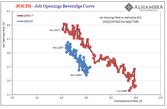
In the 1940’s, William Henry Beveridge devised a method to try to estimate any such structural economic changes by comparing the unemployment rate to some measure of generic job openings (Help Wanted ads in those days). The Beveridge Curve asserts that very relationship, meaning that there should be an inverse relationship between unemployment and Help Wanted. Plotted, this association and correlation should follow a downward sloping line where the X-axis is the unemployment rate and the Y-axis some version of business demand for labor.
It’s one of those very simple ideas that at the time was pretty genius. The Beveridge Curve is supposed to be downward sloping given the intuitively inverse relationship between unemployment and labor demand. It was in figuring out how to measure the latter that left Dr. Beveridge a place in Economics history.
Theoretically, Job Openings is one way of organically characterizing and tallying the demand for workers. In the 21st century, there are now various ways of figuring out what the appropriate format for them might be. The BLS has its way (normalizing JO by the Establishment Survey), the Federal Reserve uses another (doing the same only with the official labor force substituted).
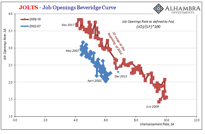
You can present the correlations with the X and Y axis switched, as many often do (I use the unemployment part on the bottom because I think it better suited graphically):
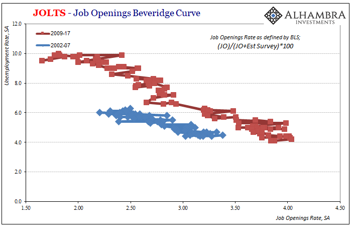
Or you can simplify everything by sticking to the basics; instead of a JO rate, just plain JO; instead of the unemployment rate, use instead the number of unemployed.
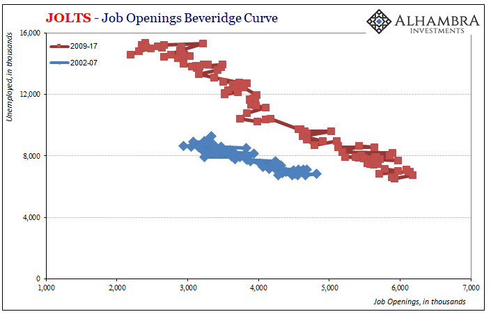
No matter how you wish to present the Beveridge Curve, the results are uniform. Each one is downward sloping to the right. More importantly, the curve appears to have shifted outward during and after the Great Recession.
Like any other economic curve, including the most basic one for supply and demand, there is no single place or definition of one. Numerous factors combine into producing not just the slope but also where the overall curve might fall. In comparing the older Beveridge Curve (precrisis) with the new (post-crisis), the change up and right is an indication of greater inefficiency or friction within the labor market itself.
An outward shifted Beveridge Curve is one that in its constituent pieces implies a higher general level of Job Openings for a given unemployment rate. In real terms, that would suggest businesses have to advertise more for the same amount of labor market utilization (at least as described by the unemployment rate or the official tally of whoever counts as unemployed). You can start to see why policymakers have turned to the opioid crisis as a potential explanation since it is at least a structural labor issue that could, in theory, produce just such an outward shift for the Beveridge Curve.
But it is not the only explanation, nor is it the only problem we find here. One possible alternate factor might be, as strange as it may sound, shyness. There is nothing that says Job Openings is the definitive measure for labor demand (not even economists would claim as much). You can easily imagine a set of conditions where businesses might freely advertise for labor but at the last minute refrain from pulling the trigger in hiring whomever responded to the advertisement.
In other words, it’s pretty easy to concede given the experience of this “recovery” that in times of heightened economic uncertainty firms could still list Job Openings (that might even be actually open) but fail to complete the process due to unusual hesitation. The longer that economic uncertainty persists, it might even become normal for this kind of change in behavior, to almost poll prospective labor market candidates (especially if Job Openings were very cheap and easy to use) in regular fashion without the same commitment to hiring.
Given the construction of the curve, that would mean more JO per level of HI, and therefore movement over time in that curve as we find here.
This outward shift in the Beveridge Curve is not unique to the US labor market, either. In April 2016, economists working for the IMF found changes in 10 out of the 12 OECD country labor markets they surveyed. Of those ten, seven were hit with an outward shift like the one found in the US (which was included in their study). Another two experienced an inward shift.
These were not, of course, mere random events of completely separated systems working out exclusively idiosyncratic factors. We know this because of the timing of the breakdowns nearly all were assigned by the IMF: Australia, outward shift, Q3 2008; Portugal, outward, Q3 2007; Sweden, outward, Q1 2008; US, outward, Q3 2008. Even those found with an inward curve change, Germany and the Czech Republic, the break was identified at around the same time (for Germany, Q1 2009; for the Czech Republic, Q2 2008).
The Great and global “Recession” therefore played the key role in altering greatly the behavior of labor markets all over the world. Nations with the inward Beveridge Curve shifts were merely those, especially Germany, poised to best take advantage of the dominant factor setting the economic circumstance of that time and what has followed since – monetary safety and liquidity.
Getting back to the United States and in using again JOLTS, we find compelling evidence that speaks to inhibition as the reason for these curve changes. If we alternately view Hires as a separate measure of labor demand, perhaps even a superior one under certain circumstances, we can plot an adjusted US Beveridge Curve replacing the JO rate with a HI rate.
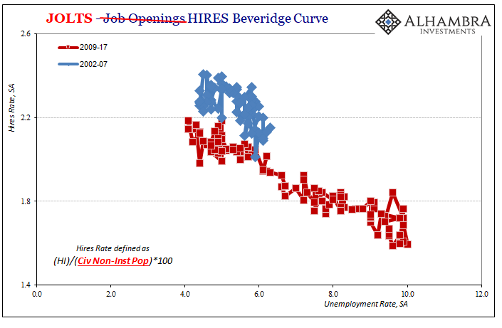
What we find here is far more consistent, with very little shift in behavior pre- versus post-crisis. It gets even better when we address the common flaw in all of this labor data, the official definition of who is or is not unemployed. All the Beveridge Curves above are limited by that fact, the millions of Americans who have fallen between official definitions; they aren’t treated as part of the labor force even though some empirical as well as anecdotal evidence continues to show that they would be if given the chance (a negative comment on labor demand immediately precluded from all those calculations and therefore curves).
Using instead the population-adjusted HI (which includes the participation problem) against an alternate unemployment rate adding back (conservatively using a slightly lower labor force participation rate than existed before 2008) some of those officially but incorrectly defined as “not in the labor force” reveals a whole lot of more consistency:
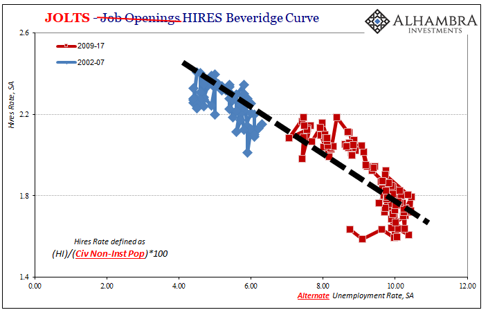
In short, when you adjust, appropriately, for the participation problem via taking into account, appropriately, changes in population there is no shift in the Beveridge Curve from the view of labor demand according to HI. Businesses in the US are hiring with the same relationship to unemployment (at the broader definition) as they have for the whole of the 21st century. What appears to have changed is how businesses view and use Job Openings, the shift in the Beveridge Curve common to a lot of other developed economies around the world.
The consistency in hiring versus the change in JO, then, would seem to suggest the alternate explanation for why there appears to have been a big change in labor market behavior from the view of labor demand. Firms at least in the US seem to be advertising jobs at a greater rate per level of hiring simply because economic uncertainty is the dominant feature of the last decade.
The dramatic upturn in US JO starting in 2014 easily follows that pattern (assuming that surge in JO wasn’t a statistical anomaly) and description. Janet Yellen and economists (really Economists) in the mainstream media constantly talked about recovery and better economic prospects (ending QE and “rate hikes”, after all) but that rhetoric was never matched by what was really going on in the economy.
Companies may have advertised for work at a much higher rate, but then balked at following through for obvious (to anyone not ideologically committed to Economics) reasons. That would have produced a serious discrepancy between HI and JO but not one with the basic background economic relationship established by William Beveridge a long, long time ago.
Stay In Touch