
It’s about time. I’ve been writing for years that the payroll reports are, mostly, irrelevant. That’s never how they are received, though, some months wherein the new low for the unemployment rate or the blowout headline payroll figure send risk markets soaring. Not this month.
Can you imagine what the last couple of reports would have done a year ago? According to the BLS, get this, the labor market hasn’t been this good since 2015! By their Establishment Survey numbers, we’re talking consistent with 2014’s “best jobs market in decades.” The economy isn’t just getting better, it’s flipping flying!
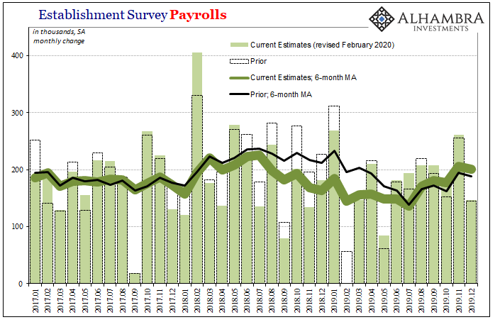
The payroll change in February was +273k, which, somehow, is exactly equal to the revised change in January; also +273k. With other recent monthly revisions, not to mention the benchmark changes which have benefited the rate of change over the latter half of 2019, the 6-month average is a sizzling (for this economy) +231k. It hadn’t gotten this “good” until June of 2014.
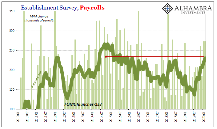
What’s really happening is incredibly odd given the entire purpose of these estimates is for them to be the most accurate. The BLS smooths and over-smooths the Establishment Survey because high frequency data is extremely noisy (just look at the confidence intervals for the monthly change, even at a 90% rather than 95% confidence). Therefore, essentially, the BLS plots a course (trend-cycle) where they think the labor market is going.
Each year the government goes back and checks on these assumptions – yes, assumptions – to see how close they might have been. Most years, not too far off. Last year, though, in March 2019, looking at state unemployment tax filings researchers found out the numbers had been way overstated.
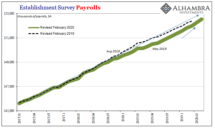
Slicing off one-fifth of all payroll gains between March 2018 and March 2019, you would think the BLS would go back and re-evaluate their original trend-cycle approximation. Apparently not. These new numbers are, like a heat-seeking missile, or predetermined outcome, fully intent on getting the series back up to where that prior trend had been moving toward.
In other words, the government says that the 2018-19 dip, which was sizeable to the point of alarming, must’ve been “transitory.” Where might they get such an idea? Not from the bond market which had been pricing that very downturn all along, and, more importantly, is right now pricing its continuation like in a second act far more devastating than the first.
Instead, these BLS trend-cycle assumptions derive from those who never saw the first wave of the downturn coming and can’t figure out why the BLS’s unemployment rate never, ever gets corroborated.
These figures, like Jay Powell’s narrative, just don’t add up. Thus, markets completely, totally ignoring what would have sparked huge relief had today’s report and the revised estimates for recent months been released a year ago – even a couple months ago.
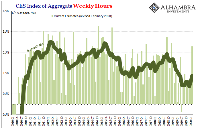
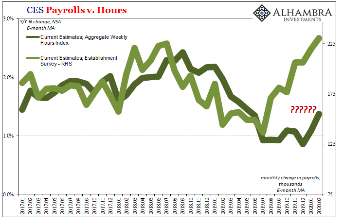
The blowout is never without its detractions; only occasionally is there a perfect payroll report and usually these show up when the economy is at its worst (I’m not claiming a conspiracy, just making another note of the randomness). You can see above the difference between hours and headline payrolls. Night and day.
The more immediate concern is what is being indicated by the Household Survey. This other employment series has flatlined – like the drop in UST yields, for the second time. It is charting out what really looks like Euro$ #4’s first and now second phases. And, unlike the la-la land the Establishment Survey is being pushed upward into, this is much more consistent with other economic data – including alternate BLS labor market estimates like JOLTS.
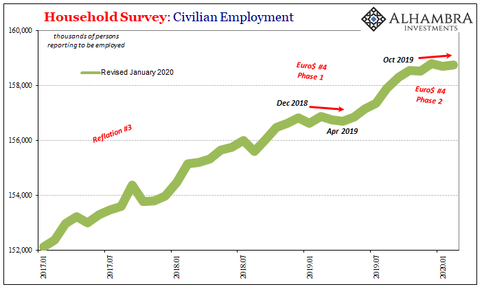
The Household Survey, I will point out, isn’t heavily smoothed like its more famous cousin.
But that’s only where the caution starts. In a traditional business cycle, the peak doesn’t just transition from robust employment growth to lay-off-all-the-workers. It proceeds in stages, as the last one did from mid-2006 into 2008. The labor market slowed throughout 2007 (which, I have to say, I was reminded of quite a lot in 2019; 2018 being a lot like 2006, too, where problems like curve inversions first showed up) before making the second transition toward the end of the year.
Benchmark revisions remade the data then, too, only afterward becoming more consistent with this staged descent (original estimates made it seem that the economy was improving late in 2007, which sounds familiar).
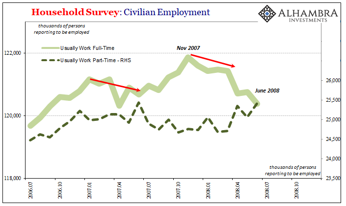
When it comes to the Household Survey data, that means full-time versus part-time. The number of households reporting members working full-time begins to drop while at the same time the number of reported members working part-time rises. Initially these offset before getting to the steep layoffs associated with recession, as companies will try to keep workers but may have to cut their hours and push them into the part-time category in order to do so.
If the economy continues to deteriorate as with any recession, this swap continues to take place only where the layoffs accelerate well beyond those converted to part-time.
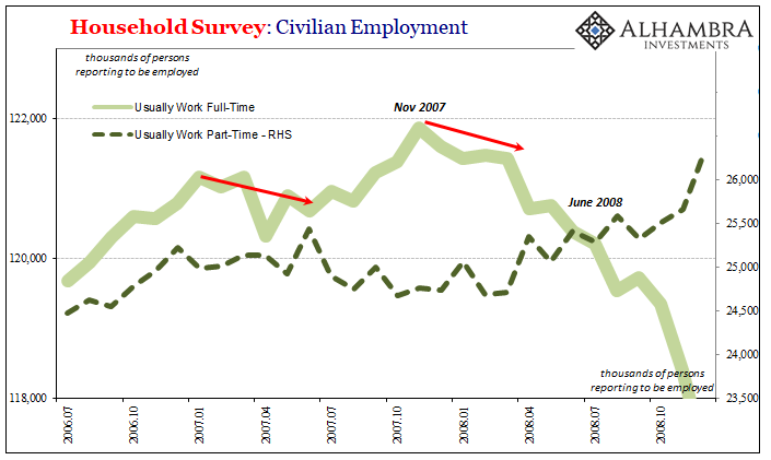
What has shown up in 2020 in the Household Survey is a hint, and nothing more than a suggestion at this point, of that potential shift. Consistent with the hours data, the BLS reports that HH Survey FT employment peaked last October, with a big drop in January, and that in the first two months of 2020 the number of PT workers surged.
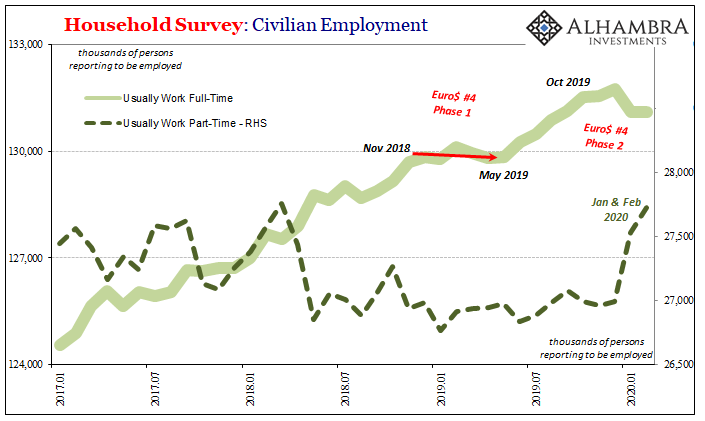
What that ultimately means as far as the economy is concerned is threatening what you see being priced out all over the marketplace, rather than the extra-special awesome headline payroll numbers. Not confirmed, but for now consistent with Euro$ #4 getting nastier in its second act.
Speaking of those awesome payroll headlines, since it’s March again I wouldn’t be surprised if when the statisticians at the BLS check the 2020 state unemployment records over the coming weeks once again they’ll be shocked to find out that, no, the current labor market isn’t anything like it was in 2014.
Not transitory, in other words. More bond-like.
Stay In Touch