
I’ve always disliked the ritual of Payroll Friday because that’s what it is. The BLS doesn’t even measure the change in payrolls, for crying out loud. The government attempts to define a very wide interval into which the real labor market may have fallen. Even then it’s nothing like precision, especially at a low 90% confidence interval.
And don’t get me started on adjusting them for population, which no one does (+200k in 2019 was nowhere near what +200k had suggested in 1999 or 1984).
These headline numbers are treated as gospel anyway, the definitive judgment on the economy. For that reason, so many multitudes have been left confused over the last decade. The payroll figures say everything is awesome because that is what everyone except the payroll figures themselves has said.
The problem therefore is one of interpretation rather than blameful statistics. I wrote more than four years ago, in January 2016 for the hugely misleading Payroll Friday picturing a December 2015 economy that outside of the Establishment Survey didn’t exist and more to the point was quickly going the wrong way:
The BLS is doing a very good job of leading its own creations to the point of irrelevancy, which is perhaps where they best belong in this “cycle.” Everything to like and dislike about the payroll reports remained exactly the same [in December ‘15].
This view may finally be coming around to widespread acceptance. For the second month in a row, massively positive gains were greeted with a collective shrug. Score one for the return of rational thinking?
Not quite.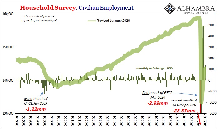
It’s that the V-shape which everyone has been hoping and praying for is now taking shape; and that’s not a good thing. When that first huge positive was published a few months ago for the month of May, everyone at the time was free to extrapolate it as wildly as they wanted to. With only the one month of rebound data in hand, you could picture the right-hand side of the “V” in any way you wished since all that first positive had meant was that there was a rebound.
A few months more, however, and the shape is starting to be filled in by more than wishful thinking. And while it’s a rebound, it’s starting to look a lot less recovery-y (see: above).
The headline Establishment Survey increased by 1.76 million in July 2020 when compared to June. Interestingly, despite admitted major problems with data collection in the age of COVID and shutdowns, the prior two months weren’t revised much at all (when during those two months the data for other previous months were revised all over the place).
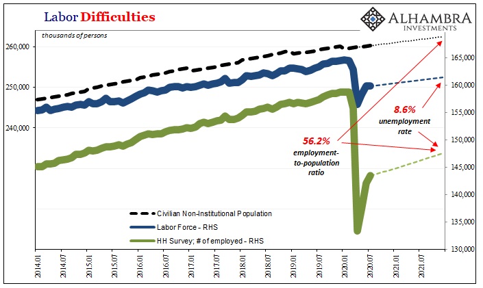
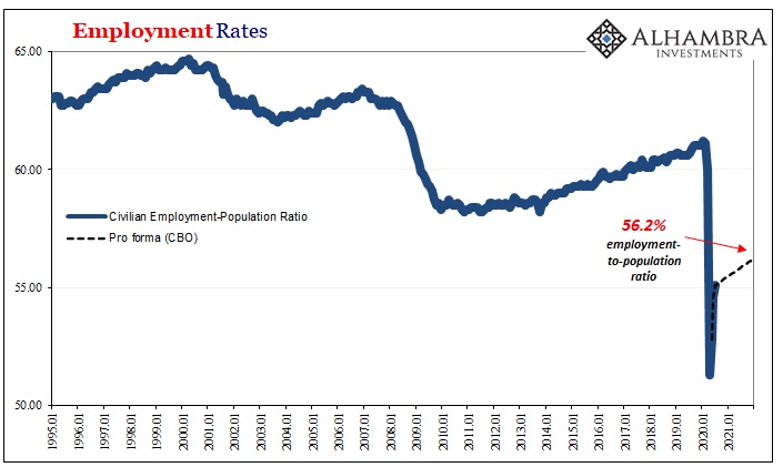
Over in the Household Survey, the number of identified employees living in each household gained “only” 1.35 million during July. That compared to +4.94 million in June and +3.84 million in May. A solid gain is good, consistent with reopening, the second derivative is not particularly now when we can really begin to see how it stacks up to the size of the economic hole we’re trying to work out from.
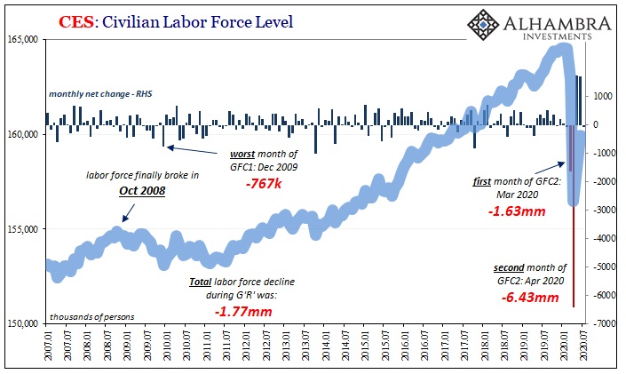
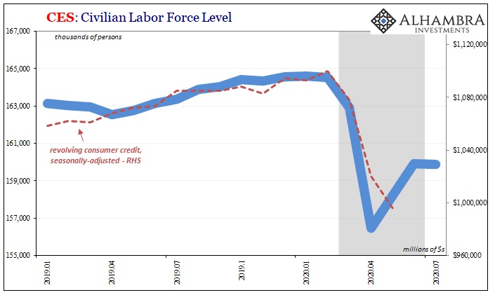
The size of the labor force actually shrank last month for the first time in several months, if only by the slimmest amount (-62k) after having gained back 3.4 million in May and June combined. While the labor force estimate is very noisy and volatile month-to-month, in a recovery economy that volatility should be focused at strictly the high end of the scale, on a potential difference between +1.7 million (like the prior two months) and maybe +1.5 million at the low end – not going from +1.7 million to -62k.
That’s not statistical noise, it’s a stark indication of what July has been looking like in a lot of other data including the payroll details beneath the headlines.
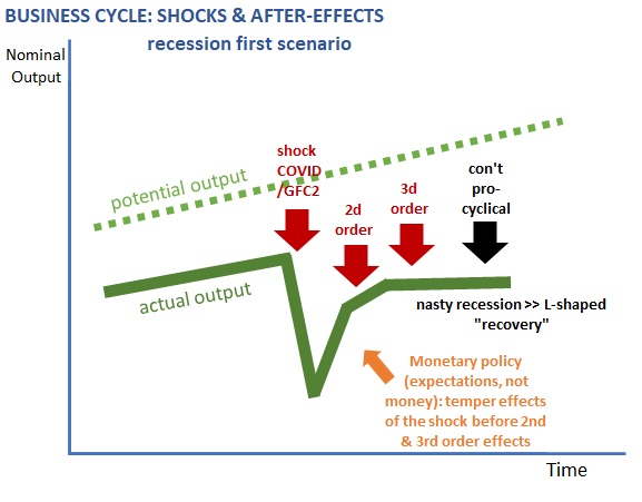
Is this thing actually looking like it might come up well short? That’s the possibility which has rendered the huge positive, and the President’s tweet prematurely celebrating it, moot and, dare I write, irrelevant. More and more you can literally see we have a long, long way to go and time is not on our side.
It was never about the size of the contraction, nor could it be about just the first step toward rebound. This whole thing rests upon whether or not everyone, and I mean everyone, gets to go back to work. When May’s number came out, it seemed more possible. June, though bigger, was overtaken by other data.
Now July is pretty damn consistent with that other data. Slowing down here is…not good.
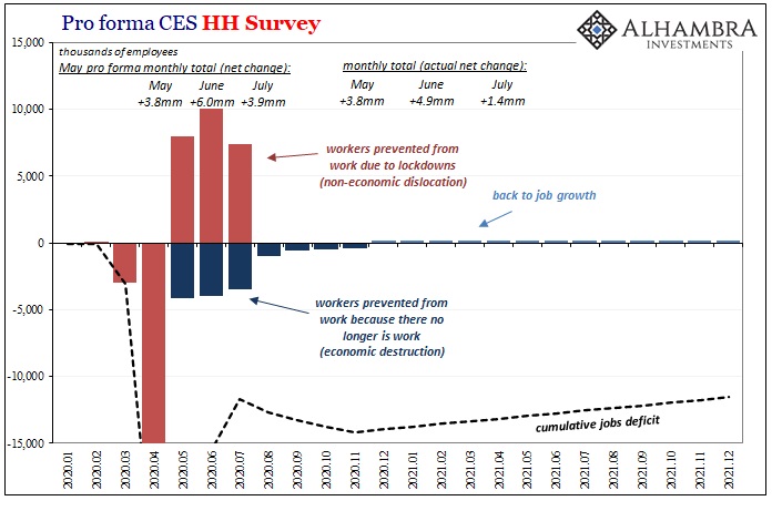
In early June, in light of the May report, when I put together my back-of-the-envelope pro forma (for the HH Survey) I imagined what it would look like if everyone who was prevented from working due to government interference got to go back to work by this month. The numbers I expected were necessarily huge, as they’ve turned out to be.
However, we always had to keep in mind the other part of the labor market – those who have no work to go back to – which is a different set of circumstances apart from reopening. So, while millions have absolutely flooded back as things opened up, other millions haven’t been so lucky. It’s the latter group which are, as I was crudely trying to demonstrate, starting to show up in the monthly payroll reports.
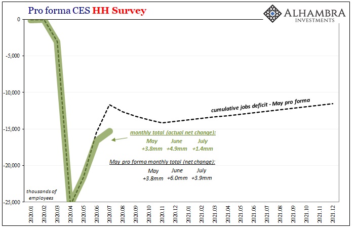
The fact that the actual numbers are coming in millions behind mine doesn’t really change the interpretation – which is, after all the hoopla and initial euphoric fury, the Household Survey, right now, is more than 15 million behind getting back to even.
FIFTEEN MILLION.
That’s a gap which even after three of the biggest months ever remains almost double the Great “Recession.” Double.
Worse, the trend is starting to look way too much like mine – which really starts to suggest, after everything, the economic rebound really can come up way, way short of what we need. Both in terms of ultimately the bounce back levels we might attain as well as, more importantly right now, in terms of time.
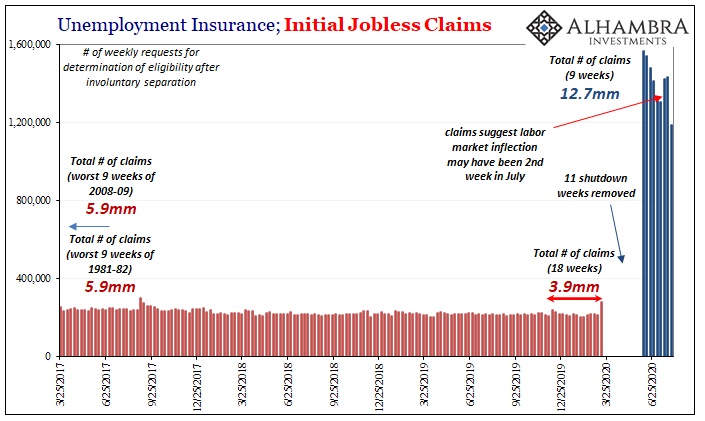
It’s a shame in one sense because initial jobless claims (below) were substantially improved in the latest weekly figures. After two weeks of rising numbers of filings, initial claims were lower by 2.5 million for the week August 1 compared to the week of July 25.
Then again, even after improving the weekly total for initial claims remains well above 1 million. Less labor market destruction than record levels of labor market destruction is still a whole lot of labor market destruction (that second group experiencing economic factors rather than the non-economic benefits of reopening).
Maybe that means an even better monthly payroll report for August, but we have to recognize that the HH and Establishment Surveys are starting to converge in the same general vicinity as continued claims. As noted above, the HH Survey is still in a 15.3 million employee deficit, not far off from the 16.1 million former American workers continuing to receive unemployment benefits from their state. 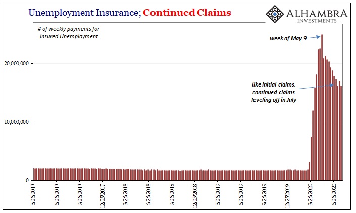
There’s one final note of caution in the employment details: hours. The rate of decline in them, year-over-year, during July 2020 would have been the second worst had it occurred within the Great “Recession” of 2008-09. What that might suggest is while millions of workers are being brought back onto payrolls, eligible now to begin working again, companies (at least not yet) may not have a lot or anywhere near the same amount of work for them to do.
We’ve been hearing anecdotes and some survey data which indicate that this is indeed the case – those who were initially laid off during the shutdown weeks and months being rehired and taken back off furlough only to be laid off all over again. If so, that’s what happens when you listen to Jay Powell.
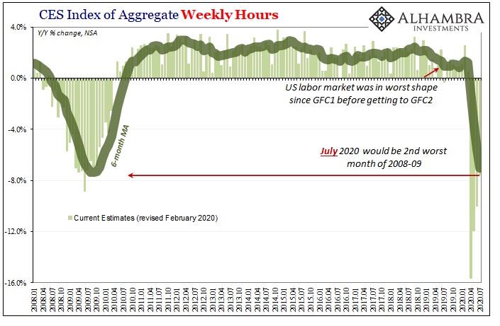
This gets at the time component – while somewhat cautiously optimistic, businesses just hanging on maybe anticipating the economy they’re all talking about in the media and trading in the stock market are finding it a much tougher go on the ground. Maybe they brought back their workers too soon, or too many of them, and the longer it takes for this rebound, a real one, to show up the more likely it will be that they stop waiting for it.
That’s the dreaded second wave, not of COVID but of economics (small “e”). And it’s another reason why the current payroll report is, and has been treated as, largely irrelevant. What is relevant is further raising that very possibility we really are coming up well short. So many potential shoes.
If all we get from every Payroll Friday is some general sense of the labor market, and it is, then that general sense has definitely changed from when the rebound was a blank canvas. Filling in that canvas hasn’t painted the pretty picture. Instead, it’s really starting to look like the monster we’ve all been worried about despite all these monster gains.
Stay In Touch