
Economists’ R*, or R-star, is a fiction. It’s one that they came up with after-the-fact to try to explain why their policies didn’t actually work the way policymakers had initially promised. While in public, officials still speak glowingly of each QE, one after another after another, in private they know it deserves absolutely no praise.
Study after study has shown basically the same thing (this pulled from a 2012 IMF research paper):
Research on the effectiveness of earlier quantitative easing has yielded mixed results, with most pointing to limited effects on economic activity. While most papers found evidence that quantitative easing helped reduce yields, its effect on economic activity and inflation was found to be small. The reasons cited included a dysfunctional banking sector, which impaired the credit channel… [emphasis added]
Helped reduce yields. That’s a very curious way to frame (in order to arrive at “mixed results”) what is its only detectable, possible contribution. In fact, even this much is debatable; ask yourself, what is it that QE is always “helping” lower rates? As I put it last week “celebrating” the undeserving theory’s unholy twentieth anniversary:
In other words, falling rates correlate with QE’s if only because rates are already falling by the time central banks get around to conducting these programs. And if yields are already dropping as things get bad enough to convince central bankers to unleash their psychology, what good are even lower interest rates than the low rates bad things have already brought up?
This is where R* supposedly comes into it. The modern central banker’s only job is to figure out a way to influence behavior; but you can’t put “behavior” into an econometric model. Thus, an imputed “natural rate” seems a plausible enough stand-in to the detached statistician with no real feel for actual economics (small “e”). To achieve success, in the regression analysis, the Fed or ECB need only drive rates below computed R* – even if the market itself is already pushing them lower.
If it seems a bit too wishy washy if not completely contradictory for what monetary policy projects for itself, that’s because it is complete nonsense. Here’s what I wrote just before the onset of Inflation Hysteria #1, back in March 2017 right at the beginning of what would shortly become that whole globally synchronized growth debacle:
R* is just the plugline or balancing factor that attempts to make sense of why neither ultra-low interest rates after the dot-com recession nor QE in the aftermath of the Great “Recession” failed to work as they “should” have. For policymakers, policy rates went low and lower but since no great recovery resulted, especially from the QE’s, it is merely asserted that R* must have been that much lower still…If “real” policy rates had been pushed down to -10%, the still lack of recovery would have left Fed officials claiming R* surely was -10.01%.
This is exactly what curves had been saying all along; not only was QE failing time and again, each time it did the market adjusted to each failure!
That’s why, on the cusp of full-blown global Euro$ #4 in early December 2018, while Jay Powell was still hiking rates expecting inflationary acceleration, I wrote up how the curves were by then totally opposed to any of it:
The world in 2018 was supposed to be well into its fairy tale ending to the last decade of nightmare. The flat yield curve even in 2017 indicated it was only a slim chance to begin with. Now finishing up this year, the probability has scaled back down to nil. Even the R-star freaks are seeing only risk.
RIP upside. The fourth chapter in the nightmare stands before us.
That’s just what followed and you can literally see this in market prices like eurodollar futures where far-forward expectations for 3-month LIBOR kept getting downgraded; a little bit after the initial GFC1 (Euro$ #1), a little bit more following the “unexpected” setbacks (read: monetary warnings) of 2010, and then a whole bunch more (never to recover) after the full weight of Euro$ #2 in 2011-12:
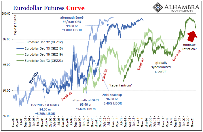
By the time Bernanke was stunned into QE3 in September 2012, the eurodollar futures market was hoping, just hoping that 3-month LIBOR might be able to achieve something like 1% in December 2015 (it didn’t); maybe 2.50% by December 2019 (a little closer).
Now in 2021, with a full Euro$ #4 and complete GFC2 in between, the market is rapidly accepting the inflation monster scenario being casually thrown around everywhere as if a fact?
No. Not even close.
The incredibly shrinking curves that put together the story of more than a decade of monetary policy looking in the wrong direction while: the dollar rose instead of fell; related, continuous disinflationary problems always superseding inflation; and interest rates adjusting to this reality rather than some fictional R* whose only real purpose is to point the blame at the real economy instead of the unfixed monetary situation behind everything.
In the aftermath of 2020, the market hopes that 3-month LIBOR (which will still be around, by the way) possibly gets to around 1.75% maybe 2.00% by mid-decade if everything goes perfectly. To even propose runaway inflation in light of these comparisons is just silly.
Don’t take my word for it; the curves have been on the case for the entire 21st century:
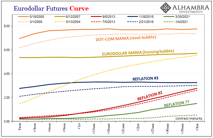
There is absolutely nothing unusual about the selloff in Treasuries and eurodollar futures; perfectly reflation-y and well within historical norms. That is the problem. Where this history has left the global economy (global money, after all) is with curves so incredibly shriveled even when they ROUT!!!!! it barely shows up.
Even now, after the reflationary selloff across the bond market, where things stand – even in R* terms, if for all the wrong reasons – is, in a word, Japanese. Unlike R*, the interest rate fallacy doesn’t lie.
Stay In Touch