
What would it look like if the Treasury market was forced into a cross between 2013 and 2018? I think it might be something like late 2021. Before getting to that, however, we have to get through the business of decoding the yield curve since Economics and the financial media have done such a thorough job of getting it entirely wrong (see: Greenspan below).
And before we can even do that, some recent housekeeping at the front of the curve where bill lives. Treasury bills have been in (our) spotlight the entirety of this particular calendar year for good and obvious reasons. Debt ceiling, dealers, monetary drama around every bend; to put it briefly, there’s been a serious shortage of the best of the best of the best collateral (for repo as well as derivatives).
Two factors have contributed to what has been at least a scarcity of collateral bordering a few times on the verge of outright shortage. The first is Treasury, the issuer. Janet Yellen’s department has been constrained by law, leaving her to sell fewer and fewer and fewer.
Supply way down.
The second collateral factor is dealers who in this sort of situation would respond to what’s really a substantial profit opportunity by expanding the collateral multiplier: repledging, reusing, and, yes, maybe some greater rehypothecation to make up all or more of the supply shortfall.
If this was a healthy system looking forward to an even healthier economic future, multiple expansion almost certainly would’ve happened already. It didn’t. Draw your own conclusions.
As of last week, Treasury has come back at least so far as the first part of the collateral drain. If you are wondering why the past few days have appeared so upbeat and reflation-y nearly across-the-board, including CNY going up sharply today, this is most likely the key reason:
Informed by the goals of its cash balance policy, Treasury intends to issue several ad hoc cash management bills (CMBs) over the next few weeks. In addition to the regular 17-week CMB, aggregate ad hoc CMB issuance during this period is anticipated to total between $175 billion and $225 billion, and the maturities of these ad hoc CMBs are expected to be between three and seven weeks.
Sale of these new issues began earlier today with an enormous tap of $60 billion 40-day CMBs that brought down $186 billion in bids (median right at 5bps, and low of 2bps). Tomorrow, Treasury will offer another $40 billion, in this instance 119-day CMBs.
This should/already has contributed something significant and positive to at least short run monetary sentiment given the lack of obvious supply before now.
Short run interest rates, it turns out, are not the sole plaything of Federal Reserve policymakers; they and their media just make it out to be this way for lack of actual money in monetary policy (expectations management). This only complicates yield curve interpretation if sticking with non-monetary worldview.
Breaking free from this indecorous Fed-centric framework, decoding this curve along with all the others is actually incredibly easy and straightforward. The public is only let in on the yield curve on the few and infrequent times when it inverts, thereby missing out on a constant stream, a true wealth of actually useful and accurate information:
The short end of the UST curve is highly influenced by the Federal Reserve’s monetary policies while the long end clarifies those policies through the prism of risk/return.
A steep yield curve, like the one pictured here [below], is one that suggests a low rate, accommodative monetary policy that is likely to work over time. This accounts for the curve’s steepness. A flat and inverted curve is the opposite. Whatever monetary policy is being conducted, the long end is interpreting that policy as well as other conditions as being highly suspect.
As I just went through, there’s more than just IOER and RRP rates to consider at the short-end. Those market technicals (collateral, primarily) along with the setting of the FOMC’s fed funds range (and those other tools which are meant to maintain it) are what influences the front part of the maturity range.
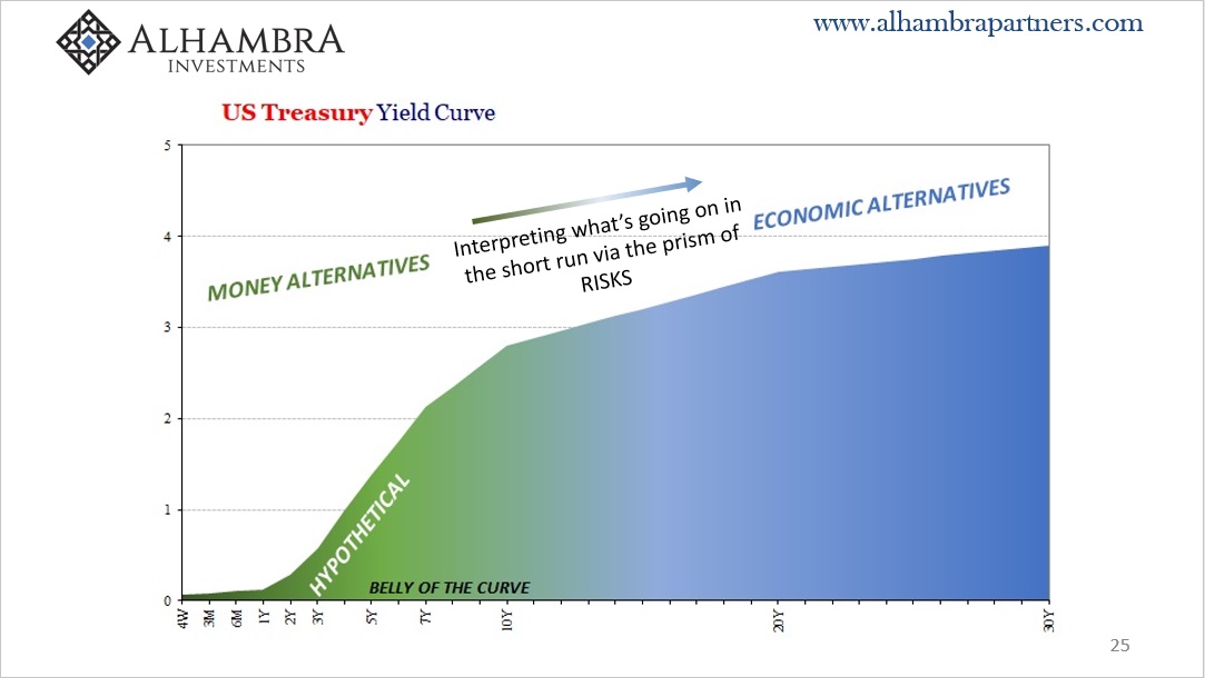
This then blends the further on you go with those longer-run considerations which Irving Fisher long ago decomposed into a combination of inflation and growth expectations. Meaning, from the front to the middle the market price/yield is a combination of money mechanics and their consequences before transitioning more completely to the latter by the time you get out 7- or 10-years and beyond.
Basically, if everything money is good up front – technical more than policy – then the market will expect higher levels of growth and inflation thereby more net selling longer run Treasuries increasing nominal rates which steepens the yield curve.
This was, in fact, 2013’s “taper tantrum.” No tantrum, rather a brief period when the global monetary marketplace seemed to fit the definition of improving which then improved the growth and inflation outlook. For one of the few times, bonds agreed with Bernanke.
As usual, it did not last very long: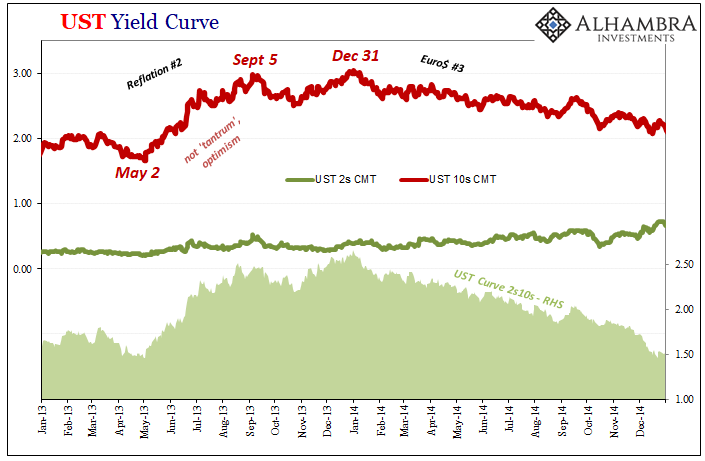
By the time Ben Bernanke had “said” taper (he didn’t actually use that word) on May 22, 2013, rates were already rising. Slightly higher growth and inflation expectations as a result of improving perceptions (less pessimistic) became the “tantrum” which, consistent with general curve interpretation, meant a substantial steepening to the curve – if only until the end of the year, an isolated case of taper hysteria lasting only about seven months total.
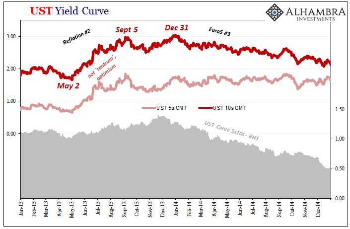
But look what followed in 2014: the front end of the curve (2s pictured above) kept going slightly higher while the 5s stopped rising and then went basically sideways for several years. Each of those were influenced by first taper before then taper’s policy daughter, the rate hike.
In other words, the market began to suspect that policymakers would fool themselves into carrying out this “tightening” two-step regardless of economic and monetary reality, leading first to tapering (December 2013) then termination (December 2014) and finally just the one rate hike at the short end (December 2015). Thus, the 2s were influenced more by those projections of policymakers being stubborn and blind while the 5s a balance between that and the opposite at the same time influencing maturities further down the yield curve.
Beginning with the first day of 2014, the long end was no longer higher growth and inflation; less, actually. While the 2s yield went up a touch and the 5s flatlined, the 10s rate (and 30s) began to drop even as Federal Reserve policymakers grew more not less confident in their economic readings (unemployment rate).
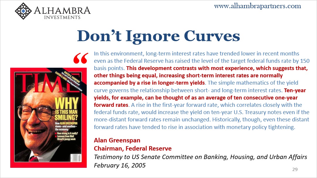
ECONOMISTS SINCE GREENSPAN (AND BEFORE) WRONGLY CONSIDER THE YIELD CURVE HOMOGENOUS UNDER THE DIRECTION OF ONLY MONETARY POLICY; THAT RATES DO *NOT* ACT INDEPENDENTLY OF FED POLICY WHEN HISTORY SHOWS THEY ABSOLUTELY ARE INDEPENDENT AND REMAIN SO.
In short, the market bet: 1. FOMC would stay hawkish; 2. Officials were absolutely wrong about why they would. Therefore, the influence of #1 more on the short end with #2 more toward the longer end, net result after 2013’s short-lived “tantrum” was a flattening curve.
As we know – and everyone should have known from the very start of 2014 if Economics wasn’t so corrupt – the yield curve got both right. The Fed tried to stay hawkish completing taper at the end of 2014, but fumbling badly on the rate hike (only a single one in December 2015) because of all the reasons (a gaining Euro$ #3) which were depressing (deflationary potential rising) the long end’s growth and inflation expectations (which are global in application, not just of the US economy) outside the central bank’s view.
This also clears up another misconception related to the “taper tantrum”, the so-called “policy error.” The latter presumes – likewise starting from the mistaken belief the Fed controls everything – hawkish policy actions caused the resulting deflation and false dawn; that tapering then a single rate hike were somehow responsible for thwarting and upending the economic setup from the “best jobs market in decades” and expected accelerating global growth.
That’s not what happened; the Fed was wrong from the very beginning. The global economy was not picking up, on the contrary falling off because the other monetary assumption(s), that QE worked, just wasn’t true. There was never “abundant” liquidity or dollars, instead Euro$ #3, the third episodic global dollar shortage, was becoming more and more a serious and overriding problem even if no central banker considered as much.
The more they become confident in their optimism and their actions, the more the yield curve flattened further, warning them, and anyone else, they were flat wrong (pun intended).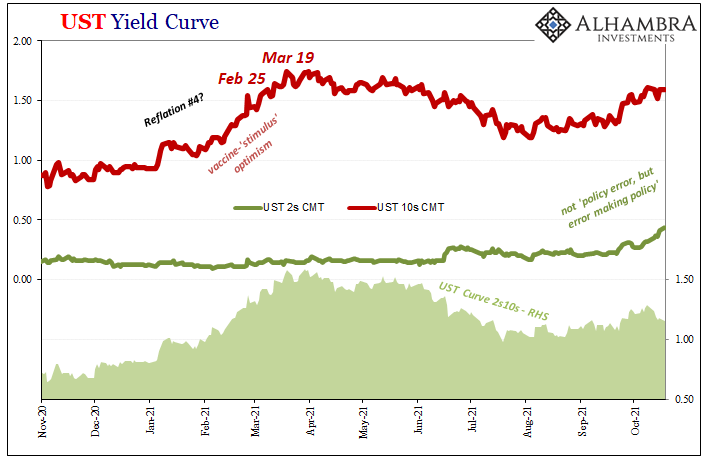
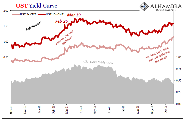
Now late in 2021, and once more the “taper” but not really a “tantrum” and more important than either: where’s the steepening?
Nominal rates since early August have been rising perhaps under modest, really minimal short-term resetting (maybe something else) toward hawkish monetary policy influencing the short end in a somewhat similar if lesser way than eight years ago. The market thinks there’s a plausible chance for the two-step: first taper at some point this year and then rate hike whenever after.
Unlike 2013, the long end today just isn’t going along with the FOMC’s more optimistic take. By contrast, in 2021, the yield curve is flattening. Whatever steepening took place did so much earlier in the year when vaccines and “stimulus” hysteria were back then unchecked.
The curve is behaving on the one hand like 2013 with taper, more significantly on the other it’s looking way too much 2018.
Like 2014 and 2018-19, the bond market believes Jay Powell if only how the Fed will taper its QE6 pace and might even manage, small probability, like Yellen in 2015 to squeak out a rate hike or two (and that’s really stretching it). The curve also says, unlike 2013 but very much like 2014 and 2018, they’re making the same mistake(s).
It’s not a policy error; it’s that the market understands how no one at the Fed seems to understand what makes good the global economy, how the monetary system actually functions in reality, or the bond market which combines the two into very useful and incredibly helpful indications – if you know how to decode them.
Interpretation is only made confusing and difficult if you somehow still believe Don’t Fight The Fed.
Last thing: I have to believe that one reason why there’s flattening is actually T-bills despite Janet Yellen’s Treasury Department having alleviated some supply strain for a time. While taking care of some on that side, it tells us nothing about that other at times more central factor, the dealer-set collateral multiplier. As the global economy heads south, or just more soft, history has shown the multiple tends to contract regardless of rising supply therefore raising the chances deflation shows up and interrupts the economy first.
And that history of collateral-induced false dawns absolutely includes flattening in both 2014 as well as 2018 into 2019’s increasingly dangerous collateral bottleneck.
Stay In Touch