
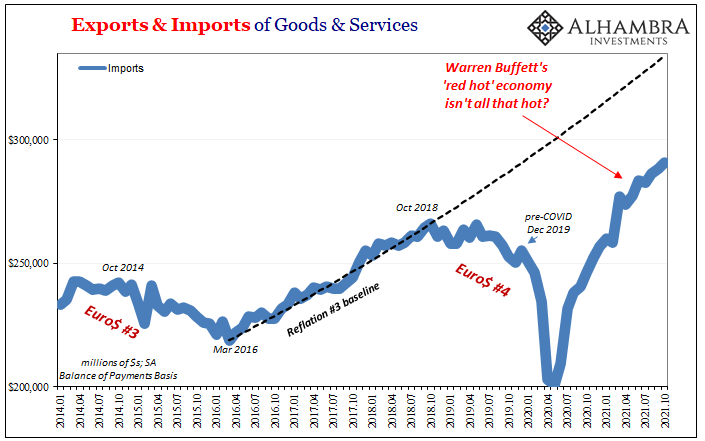
The US Census Bureau today reported that US imports of goods and services reached a record monthly high of $290.7 billion in October 2021. Just goods alone, the figure was $241.1 billion, which was 11% greater than the previous peak set way back in October 2018. With (questionable) media accounts continuing to highlight West Coast port traffic, there may not otherwise seem any end in sight to the “inflationary” goods boom as consumer spend themselves to the moon.
The money illusion, however, is creating the impression of just this sort of trend. Fortunately, the Census Bureau also gives us a crude measure to specifically import (and export) volumes adjusting for prices. When doing so, October 2021 imports of goods were a price-adjusted 6% more than they had been in October 2018.
While that in itself is a big difference, more so is the one since March this year. Even in nominal terms, US demand for foreign goods has clearly slowed way down from the frenetic pace begun during last year’s reopening. It’s still rising (as is imports of services), yet all of it and more is attributable to “inflation”, or mere price changes.
And even in the best months, nominal inbound trade remains well off the prior trend.
In real terms, more or less, the Census Bureau believes the volume of goods has actually declined by 1.5% over these particular seven months when bond yields have fallen, curves have flattened, and deflationary signals proliferated long before either delta or omicron variants to the coronavirus.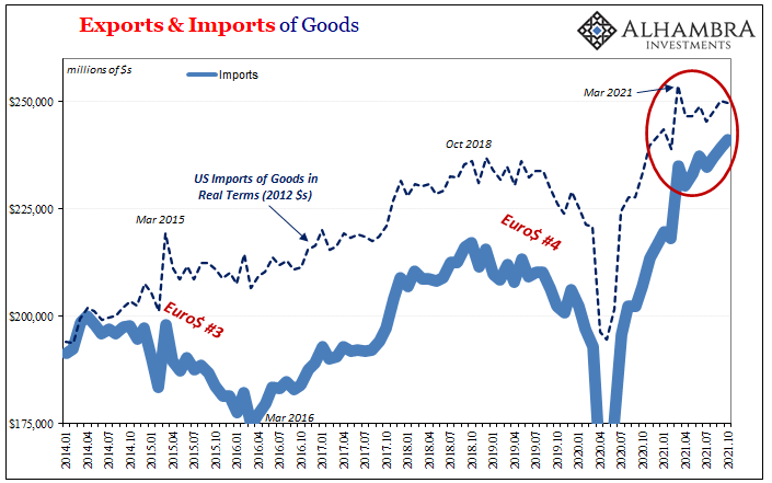
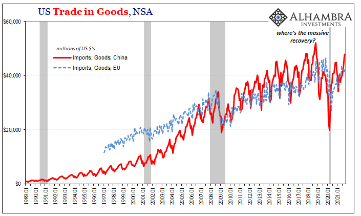
Imports coming from the US’s largest trading partners are actually substantially less than they had been several years ago – indicating that much of what’s been shipped to America hasn’t been the usual traded stuff (not just missing autos). The manufacture of consumer goods, in particular, coming from China and Europe hasn’t matched the rhetoric surrounding either the goods boom or the “inflation” created by it.
Quite a lot of nominal trade, then, is the US import of high- and higher-priced raw materials rather than mainly due to booming consumer spending.
Supply constraints?
This volume difference, or money illusion, has been spotted all over the world. It has been more difficult to pick up in places like China, for all the usual reasons of questionable data, questionable data collection practices (discontinuities), and perhaps even a sprinkle of politics like those made by the particulars of this pandemic.
For instance, without factoring prices, there’s been a huge difference in data for what should be two sides of the same thing: US imports from China, as estimated by the Census Bureau; Chinese exports to the US, as estimated by its General Administration of Customs.
Yet, for most of this year – focused more so since March 2021 – the Chinese claim a whole lot more goods have been sent to the United States than the United States estimates has been received from China. Once upon a time, the data had largely matched, and when it may not have the discrepancy was nowhere near this huge.
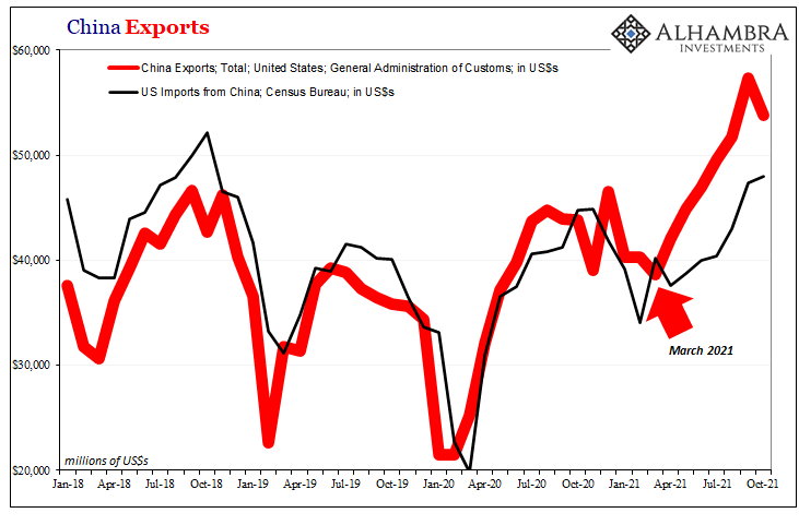
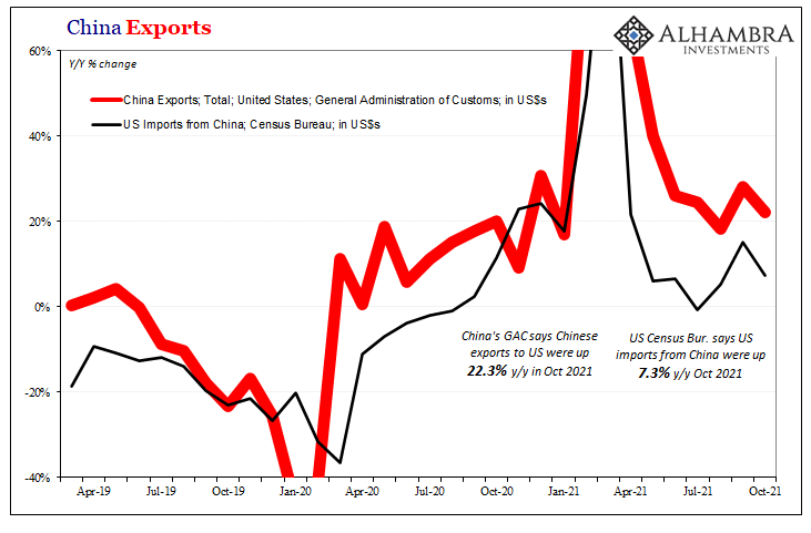
There are any number of potential reasons for this, though only one, to my view, seems plausibly able to satisfactorily explain what is a mostly post-COVID divergence: the ongoing “trade wars” leading Chinese shippers to reroute goods through intermediary countries to avoid certain tariffs; lags in shipping times that have gotten lag-gier with purported US port difficulties; or, perhaps pricing differences on the most basic level.
It’s the last one that potentially includes at least a little bit of history; the Chinese practice of over-invoicing goods (having used Hong Kong as the staging point for this accounting fiction) so as to import more US$s for “exported” goods on the back end outside the scrutiny of financial authorities.
This would certainly fit given the dollar shortage which has been plaguing China all year, as the data makes plain, but especially February 2021 forward fitting the same timeframe. 
In addition to what would be a very different kind of money illusion in terms of Chinese exports, there’s the same one applied to China’s imports from around the rest of the world (not the US; the Chinese buy very little of American products or services).
China’s GAC says imports into that country continue to rise at a seemingly decent rate, up a sizzling 31.7% year-over-year in October, yet much of that change is attributable to base effects first before even getting to possible price effects. The 2-year change (annual rate) was only 17.4%, which only sounds still-terrific outside of historical context.
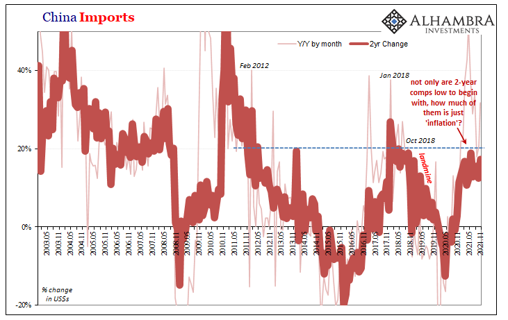 Recent 2-year rates of change in China’s imports aren’t any different from 2018’s, which should already ring substantial alarm bells given how 2018’s import activity left the rest of the world facing a substantial shortfall (in trade) and downturn/recession long before COVID would plague China.
And, again, the money illusion in Chinese trade masks what in volume must be even less than 2018; not just rates of change, also absolute terms. Using the iron ore example I had presented last month, with iron prices collapsing since July the illusion is now far less misleading.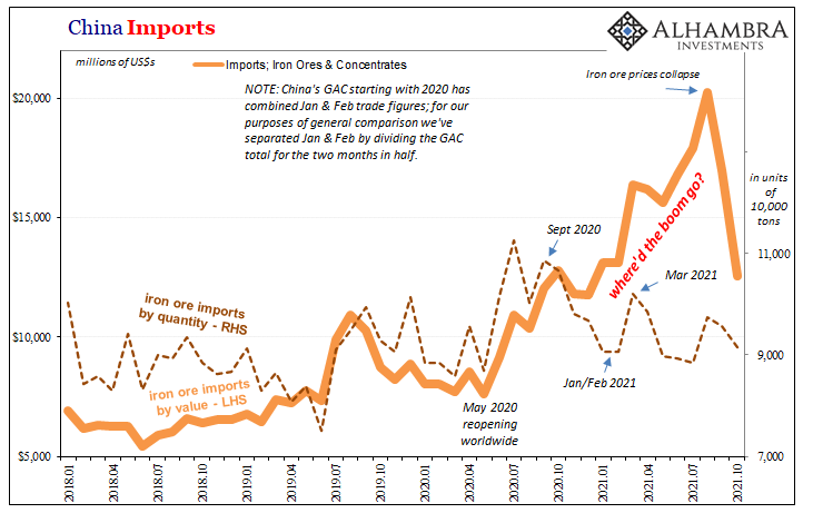
But if we’re really looking to confirm or deny the world’s developing “growth scare” from this global trade perspective, we don’t even need to adjust for prices to see how Chinese demand for more finished goods – like in the US – has tailed off dramatically only from there going back all the way to the end of last year.
China’s imports from Europe, Germany expressly, have declined by a sizable amount compared to last December, a downturn which amplified around, like a whole lot of things globally, July.
Even with nominal prices up as far as they have gone on traded items and goods, this data from China aligns only-too-well with “growth scare” as it would if the Chinese internal economy was at the forefront of growing weakness – prices included. 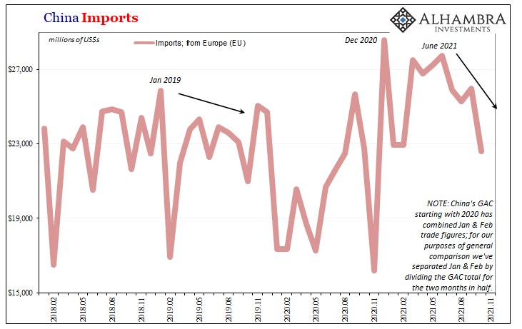
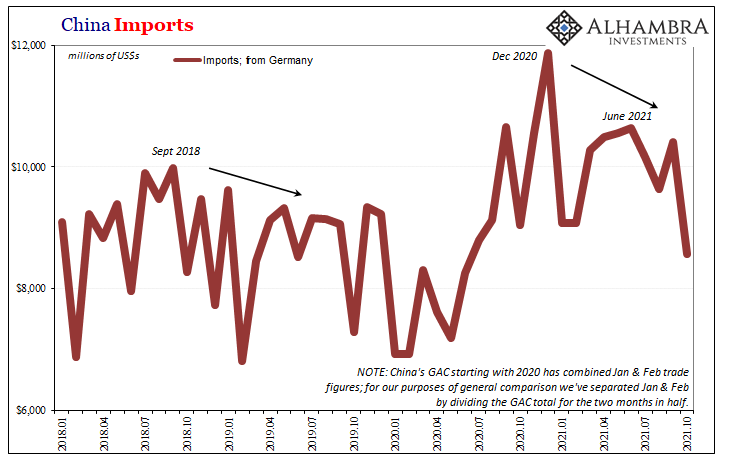
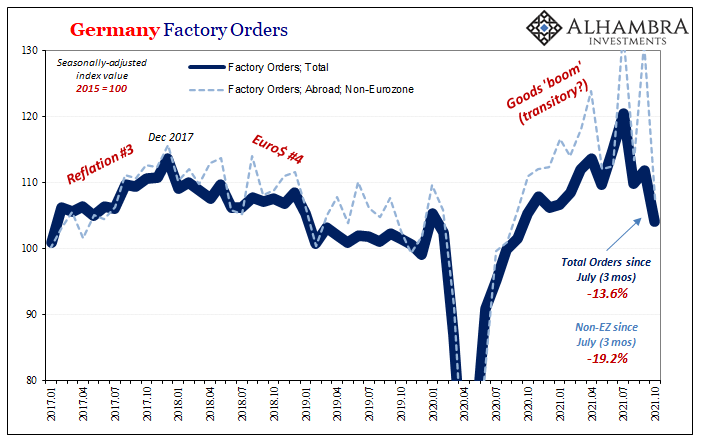
These import figures certainly corroborate the same trends coming from places like Germany which are global bellwethers largely for how closely tied German industry is with China’s internal demand situation (that never seems to match inflationary narratives in whichever time period).
Altogether, on the surface there appears to be, from an American perspective, an inflationary boom still booming. All the while, at the very least something changed after March and April in the US besides prices. More concerning, something more changed in that same wrong direction for China (therefore Europe and elsewhere) also entering summer.
Just how much has become more serious weakness is a matter for statistics and the nominal illusion. Even if we can’t accurately figure it, in one sense it doesn’t necessarily matter.
For an inflationary boom, a real one for the whole system, there shouldn’t be any ambiguity let alone so many clear cases of the wrong factors and outcomes. And that’s before observing outright, outstanding weakness in very clear-cut fashion from the one place on Earth the rest of Earth is counting on – and has been told to count on – to pull the global economy up the whole rest of the way from a mess now almost two years old.
There are goods flowing, as there always are, it’s these too many questions and outright contradictions which leave the world’s bond curve(s) too much to its deepening skepticism. There be landmines, alright. 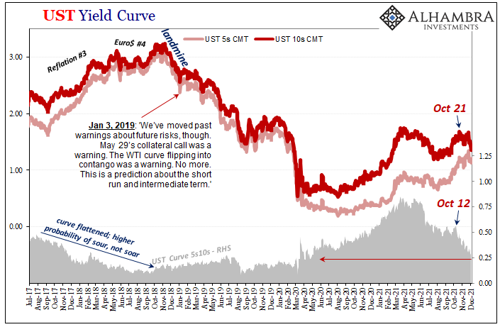
Stay In Touch