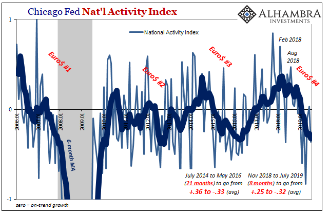
The Chicago Fed’s National Activity Index (NAI) fell to -0.36 in July. That’s down from a +0.10 in June. By itself, the change from positive to negative tells us very little, as does the absolute level below zero. What’s interesting to note about this one measure is the average but more so its rate of change.
The index itself is a product of econometric research. Economists had been searching for an alternative to the unemployment rate in order to increase the predictive power of their inflation signals. They came up with the original index consisting of 61 variables. The latest incarnation includes 85.
Rather than do much for inflation forecasting, the NAI captures a broad sense of the economy’s ups and downs. That’s hardly surprising given the wide scope of the underlying data contained within it.

As you can see above, the index has captured last year’s landmine. The last significantly positive number was for November 2018 and it has been downhill ever since. Even though the index is extremely noisy month to month, there has only been (after recent revisions) one month above zero (June 2019) in the last eight.
It brings the 6-month average down to a chilly -0.32. That pretty much equals the lowest points for each of the prior two Euro$ episodes; meaning that for July 2019 the NAI suggests growth is as far below trend as it may have been at any of the worst moments of the last ten years. That’s something to consider.
But more so it is the rate of change. During Euro$ #3, for instance, the index’s average traveled very much the same distance. Starting out around +0.36, by the trough of that “manufacturing” or “earnings” recession (a true near miss in every legitimate sense) it was -0.33.
It took 21 months to get that far from peak to trough. During Euro$ #4, it has taken only eight. That indicates a pretty substantial change in direction unlike what the index had indicated in the recent past. And that potentially signals a faster deterioration and therefore the possibility of a greater downside risk.

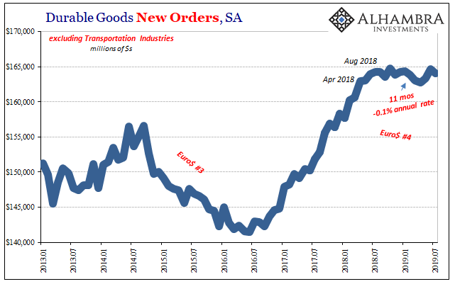
That seems to be at odds with other datapoints – even in the manufacturing segment. In durable goods, for example, the latest figures (released today) suggest that at worst there is a lack of growth dating back to the middle of last year. It’s definitely a change in condition, out of reflation, but it’s not immediately clear into what new shape or instance.
At the very least, it seems at odds with the kind of deterioration showing up in the NAI. In terms of durable goods, anyway, Euro$ #4 doesn’t appear to even match up with the near recession of Euro$ #3 let alone something closer to Euro$ #1 (or some other type of full-scale recession).

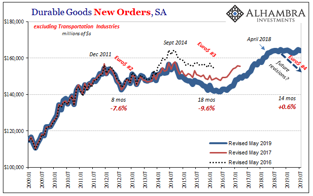
But we have to keep in mind the recent history of what has turned out to be (every time) biased data. The initial estimates for durable goods orders back in 2014 and 2015 under different benchmark assumptions had produced a trend in them which more closely resembles what we see today for 2018 and 2019; lower and more sideways. It had significantly understated the downturn in closer to real-time.
The Census Bureau never cops to any explanation for the difference, which over time fleshes out a much deeper and sharper downturn than was expressed in those original estimates. It is one reason why the public, or at least the few members of the public who might pay attention to something like durable goods, can end up with the wrong impression. It might not have seemed that bad four years ago, either.
And there are no widely shared media stories about the revisions. Few will care that three years afterward the data finally falls inline with bond market behavior as well as the more negative of economic data (like retail sales and global trade).
Without that kind of comprehensive reporting, confusion is the only real result. What’s all the fuss? It doesn’t really help that the estimates are changed two and three years afterward to finally answer that question. By then the world has moved on.
It mattered quite a bit, though, since in eventually confirming the downturn it also confirmed the cycling between only Euro$ problems and reflation. Understanding this difference was one key to deciphering the overhyping of 2017’s Reflation #3.
The problem is trend-cycle; a deeper bias hidden within almost every economic account. For quite legitimate reasons, statisticians make a judgment, yes, judgment, about the state of the economy and put it into the high-frequency data. The annual benchmark assessments check to see whether those assumptions were valid.
What we see in especially durable goods is that the statisticians don’t perform very well whenever one of these downturns “unexpectedly” shows up. The high frequency data, and the initial estimates, capture only that something has or had changed but are unable to more fully describe what it was as well as the more important estimates of its scope and depth.
In other words, what’s important right now is what’s in agreement between the NAI and something like durable goods. They both are telling us that the general condition of the US economy changed and at nearly the same point last year (August), pretty solid confirmation of what Jay Powell would like to think hasn’t happened. It’s his position that the same economy economic condition remains and will prevail following the expiration of “transitory” “cross currents.”
Durable goods as well as his own Chicago Fed number corroborate how that isn’t the overall case. The economy almost certainly shifted out of reflation and into a different baseline or underlying condition.
The NAI then suggests it was a much sharper and more severe change. Durable goods data say maybe not, but it has been a highly unreliable source in the past during similar circumstances.
There is a very good chance that over the next few years we find out the NAI was more accurate. The bond market is certainly betting that way.

Stay In Touch