
Yesterday’s publication of PCE and Personal Income also included the monthly update for the PCE Deflator, the Federal Reserve’s stated preference for measuring inflation in the economy. The June 2016 figures for the deflator were also negative in terms of both short and longer term perspectives. The year-over-year change in the index was just 0.88%, down slightly from 0.94% in May and the second consecutive deceleration. Benchmark revisions altered somewhat the exact numbers for the past few years, but overall measured inflation remains suspiciously subdued.
Going back to December 2014, the new revised data set shows only one month (January 2016, ironically) out of the past nineteen with more than 1% inflation. The record of total futility now stretches an unthinkable 50 months; the last time the PCE Deflator showed price changes equal or “better” than the official monetary policy target of 2% was April 2012. Not only is calculated inflation stretching more than four years of defiance, it is again moving in the opposite direction of official monetary goals.
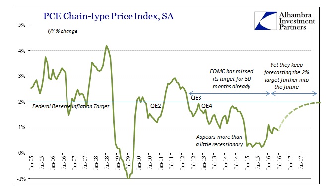
Even though by the middle of 2014 it had already been two years since achieving their target, the Federal Reserve looked at crashing oil prices from that point forward as a temporary factor rather than an amplification of whatever problem dating back to 2011 and 2012. They spent all of 2015 waiting for the base effect of oil prices to diminish, ever faithful to the orthodox idea of QE actually working. Starting in 2016, that did appear to be a possibility as again the PCE deflator moved above 1% for the first time in more than a year, but it was barely more than 1% and, as noted above, didn’t last but one month.
Clearly there are more than oil prices and base effects at work. Again, rather than being some new complication to the economy, it was in reality just a continuance of a longer-term trend that economists refuse to recognize especially when it comes to inflation. As I noted for the last FOMC meeting, the fact that the accompanying policy statement with each and every meeting remains almost exactly the same when discussing inflation is the most meaningful part of it.
In reality, the Federal Reserve economists have no idea what is happening and why inflation hasn’t responded to QE. This is not a trivial discrepancy, as monetary policy and balance sheet expansion should have very direct and obvious effects (“money printing” and threats of it are the core elements of monetary theory and policy). The economy in late 2014 to them signaled nothing but clear sailing, but instead it suddenly and globally fell off; yet they still are looking for that clear sailing as if the entire global economy contracting in synchronized fashion is just some random fluctuation of no particular concern because they view money from perspective of QE.
The Fed unleashed nearly $2 trillion in additional “money printing” during these past four years, and yet inflation has only moved further away from and under the policy target. The media even constantly referred to QE’s 3 and 4 as “money printing” as if to emphasize the psychology of monetarism, yet the correlation was more inverse and nothing like direct.
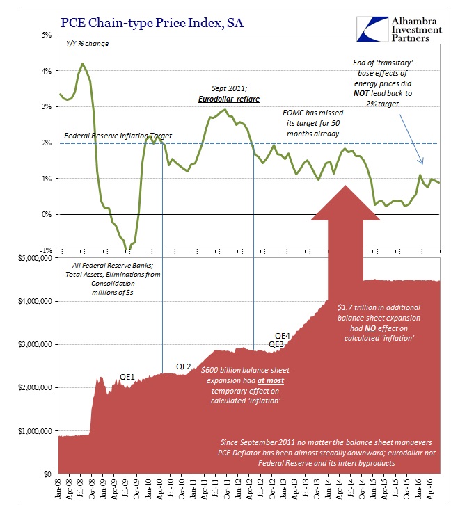
A wider historical perspective reveals this contradiction. Before 2008, the PCE Deflator tended to be above the inflation target on a sustained basis even though the Federal Reserve was in direct terms totally inactive. In fact, the only change in monetary policy during that time was Alan Greenspan’s so-called “tightening” that instead led to his “conundrum” (and the absurd “global savings glut” pretext). On this side of the Great Recession, however, the Fed has been actively engaged in all sorts of “extraordinary” programs including ZIRP and QE – and the PCE Deflator has continued to move into the opposite condition.
In other words, no matter what little the Fed did before, the measured rate remained on the high side of the target; no matter what great extent the Fed took after the crisis, the deflator continues underneath to an increasing degree. This kind of general inverse correlation should cause a great deal of consternation as well as rethinking of monetary policy right down to its core philosophy, especially what actually counts as “money printing.”

The near mirror image of both inflation and monetary policy is significant, suggesting that monetary officials and their efforts are reactionary rather than proactive or even interruptive. QE3 and then QE4 did not stop and reverse the trend of inflation, in either the PCE Deflator or the CPI, it was merely in response to them as they continued on lower anyway. That was the same as the initial “extraordinary policies” that sought to arrest the 2008 panic before it became a full-blown economic crisis; obviously, they didn’t work then, either.
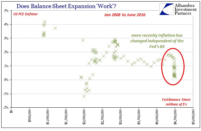
When you search for a statistical relationship between the Fed’s balance sheet, for example, and the PCE Deflator that is the most potentially significant interpretation.
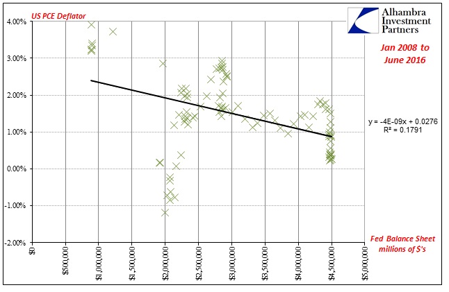
What we should see is an upward sloping regression line with a significant R-squared that suggests non-randomness in the relationship. Instead, the line slopes downward which at most advises a reactionary stance as I proposed above. In reality, the statistics show very little relationship between the size of the Fed balance sheet and inflation in any direction.
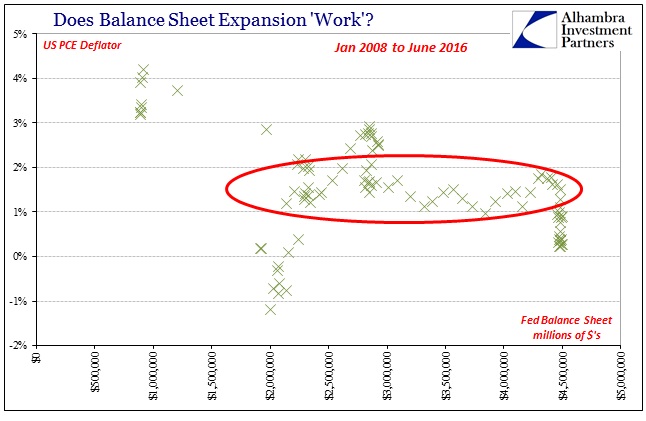
In fact, as you can see above, when the Fed was actively expanding its balance sheet in any one of the four QE’s (three and four acting concurrently) the PCE Deflator remains largely between 1% and 2%, demonstrating no tangible effect from QE expansion itself. That interpretation is strengthened by the behavior of inflation since 2014, where the Fed’s balance sheet has been almost perfectly stable (as a matter of intentional policy) but inflation has moved more so than before.
Since the absolute dollar level of the Fed’s size may not be the best predictor of inflation, we can run the same correlations using instead several views of momentum or balance sheet change; I will use a 1-year percent change but the regressions really don’t change much by varying the length of time.
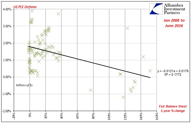
Again, the regression is statistically insignificant and at best suggesting once more the reactionary, ineffectiveness of the Fed’s balance sheet size. The outliers in the bottom right corner are the initial “emergency” responses in 2008 and really 2009. To be even more charitable toward the idea of monetary effectiveness, we can remove that time period as a matter of the panic itself as if it were potential bias introduced by the meltdown as a matter of being more than any policy could reasonably handle.

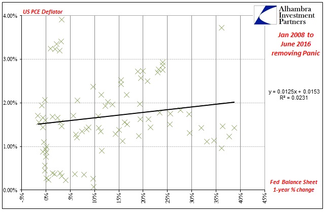
By doing so we clear out the negative slope/slightly inverse correlation in favor of what is now almost total randomness. The regression slope is slightly positive but the statistics bear out that the regression function has almost no predictive relationship between balance sheet momentum and inflation. The scatterplot above is as close to the textbook definition of random, uncorrelated behavior as you might find in the real world (as the R-squared of just about zero protests).
This distinct lack of relationship, at best, and hint of inverse, at worst, is not limited to the US experience with QE and balance sheet expansion. In both of the other major experimentations, in Japan and Europe, the results are even more robust because in those jurisdictions we find all scenarios within the data sets. Where the US Federal Reserve since 2008 has only chosen between expanding and not doing so, the Bank of Japan and ECB have introduced balance sheet contraction that allows us to conduct a more comprehensive survey of policy options and relationships.
As expected, however, the results are nearly identical to what we find here. The best evidence for QE is that we can find no relationship to inflation whatsoever. The sample size in terms of years (with BoJ experience both expanding and contracting several times for more than fifteen years) and across three jurisdictions yields significant findings that should alter at least mainstream perception of monetary “stimulus.” Popular perception is already way ahead on the count.
European statistics are here.
Japanese statistics are here.
Concluding thoughts are here.
Stay In Touch