
Since I believe the Gallup poll estimates to be significant, I want to revisit them with the addition of one more factor which I think further illustrates the distinct lack of progress toward escape velocity. By Gallup’s own definitions, they ask respondents (with representative sampling techniques, including a 50% landline/50% cell mix) what they spent yesterday apart from homes, autos and basic bills. The idea is to try to gauge discretionary spending which is probably a decent proxy for consumer health.
The poll results take no account of price changes, however, noting only what are nominal levels of assumed representative discretion. So where spending in June 2014 was slightly higher than June 2013 on a nominal basis, and still well-below June 2008, the results change more than a little when we consider even official calculations of price movements.
This is certainly not a “scientific” study of exact factors, but it is not intended as such and is nothing more than mildly illustrative.
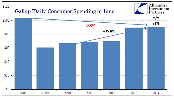
The basic case is as presented by Gallup, with what looks like pretty significant improvement during the latter QE regimes. When compared to 2008 though, recovery is still a long way off which confounds all the ruminations of “stimulus.” That seems to put more emphasis on the way down in terms of apportioning blame and figuring out causation.
However, deflating Gallup’s sequence of June spending estimates by the CPI-U, the figures stretch in the “wrong” direction. Given that we are talking about a lot more calendar than just a few months or even years, price changes, however badly calculated or ill-suited to the designed task, need to be included in the analysis. That is made all the more relevant given the imperfect situation of monetary intentions upon all manner of prices (and expectations for prices).
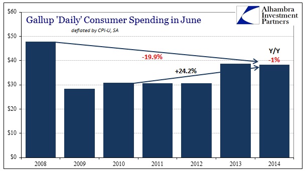
Just a simple deflation of Gallup’s figures by the overall CPI index shows that spending patterns remain further behind than revealed by nominal estimates alone. That includes the full picture of the rebound since 2010 that ends up as far less impressive – not to mention that the year-over-year change from June 2013 to June 2014 flips signs.
But the CPI contains a lot of “stuff” in the calculation that does not apply to the narrow view of discretionary spending. Furthermore, individual choices and preferences are affected to varying degrees by their own situations, which include the proportion of budgets devoted to basic necessities (which is heavily dependent on income scale and wage growth, or lack thereof).
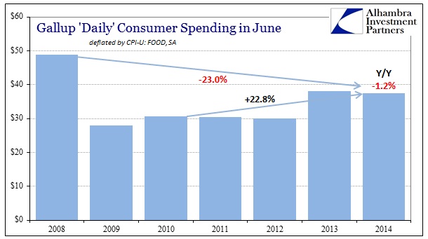
Using, then, the CPI-U Food price index changes the pattern even more in the “wrong” direction, as all the main comparisons get slightly worse since food prices have moved, even in official calculations, faster than the overall index.
But it is the energy index which is probably the most illustrative to what I am trying to unpack from all this disparate data.
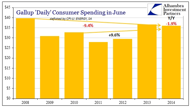
Again, individual budgets determine the appropriateness of the energy deflator vs. the food deflator vs. any other major spending components. That said, energy has been a serious cost problem that has been a persistent drag whatever the ultimate proportionality for households. In the figures above, you see a tremendous “improvement” in the 2008 comparison, as deflated spending in June 2014 is only 9.4% below June 2008, but that is highly misleading and instead offers itself as good evidence for the very problem at issue.
Energy prices in June 2008 were obscenely high, and while CPI indices and even the very basic orthodox interpretation of “inflation” is always a derivative growth rate, the fact that there is not an actual “deflation” in energy costs across this “recovery” period is an indictment on everything about this cycle. To be slightly elevated in comparison to that era is a horrendous result, as it simply means that the corrosive energy “inflation” has been a relatively constant feature for consumers. That also shows up not just as a pretty flat pattern from 2008 through to 2014 immediately above, but also in the highly diminished improvement since 2010.
In short, if people were having trouble affording discretionary items in 2008, they are actually worse now in terms of the proportion of spending devoted to energy. And, as I showed a couple months back, the lack of actual wage growth means that said proportion is actually the most significant variable in the spending equation since the absence of income growth means a crowding out of so many other items and intentions.
In terms of the recent indications about jobs and spending, this simply adds another layer to the ledger side already stacked against “the strongest payroll growth since…” As for the overall recovery, what we thought was bad is actually much worse since so much of this is hidden in the generalities of the economic accounts that seek to avoid such “complexities.” Again, lower income folks, the “unlucky” multitude without access of any kind to asset inflation, are more likely to have experienced the “recovery” in spending shown by the CPI-U ENERGY than the others.
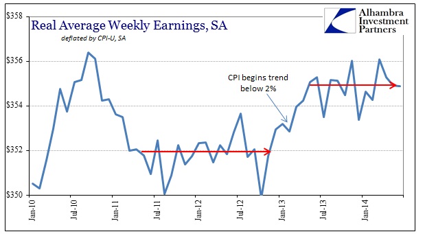
Again, all of this gets back to the real anchor to prices (inflation measures prices against prices which is beyond folly) which is wages. Real wages, using just the CPI-U, look remarkably similar to the spending figures from Gallup. That includes both the context of the recovery and the last year or so – which is a big problem for anyone searching for an exit to the malaise.
Given the caveat I expressed at the beginning, there exists the non-trivial possibility that the corruptions I have presented here are meaningless, particularly since they have been cobbled together from perhaps incompatible data sources. Even with that in mind, however, I still think this all offers a far better explanatory paradigm than anything offered by mainstream commentary – snowstorms and GDP aberrations, indeed.
Click here to sign up for our free weekly e-newsletter.
“Wealth preservation and accumulation through thoughtful investing.”
For information on Alhambra Investment Partners’ money management services and global portfolio approach to capital preservation, contact us at: jhudak@4kb.d43.myftpupload.com
Stay In Touch