The JOLTS series had always been a seemingly superfluous set of labor numbers for the Bureau of Labor Statistics (BLS). The agency wanted to go deeper into employment when it originally presented these other series in 2002. The unemployment rate seemed accurate enough, but it came at the labor market solely from the view of labor supply.
As the BLS said of its new set of figures in their initial publication:
The number of unfilled jobs—used to calculate the job openings rate—is an important measure of the unmet demand for labor. With that statistic, it is possible to paint a more complete picture of the U.S. labor market than by looking solely at the unemployment rate, a measure of the excess supply of labor.
There hadn’t been much attention paid to bureau’s measure of job openings (JO) until around 2014. That’s when Janet Yellen told Bloomberg this one piece of JOLTS had found its way onto her so-called economic dashboard; one of a broad range of indicators telling the then-Federal Reserve Chairman how the economy might really be doing underneath the headlines.
In truth, JO was included because it had become one of the few statistics to suggest to policymakers what they wanted to find. The unemployment rate had descended far faster and far farther than even the most optimistic of optimists had ever expected. That would be a good thing, a great thing, if it could be corroborated as a macro case.
The case against the unemployment rate was simple – slack. The reason it was dropping was Americans weren’t entering or re-entering (workers laid off during the Great “Recession” who have remained on the sidelines) the labor force like they should have. This participation problem has vexed officials in every context.
Somewhere someone had hit upon the idea that this slack was its own thing. It wasn’t a macro factor, according to the idea, rather the demographic makeup of the country has been changed – in more ways than one. Baby Boomers were and are retiring while those in the younger age groups have become lazy (don’t want to go back to college to acquire “modern” skills) or drug addicted.
From Janet Yellen’s perspective, the Fed was doing and maybe even had done its job. They created the right macro environment, genius monetary policies had healed the economy after 2008’s expansive rift. The problem wasn’t theirs; it is ours.
In other words, companies wanted more labor. They just couldn’t find enough which might be suitable. JO suggested to American officials exactly this other case.
Failed “stimulus” and therefore a failed economic recovery weren’t holding the labor market back as might have been indicated by the participation problem. Instead, going by JO it was the labor market holding the economy back! Brilliant. QE was off the hook.
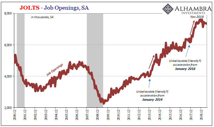
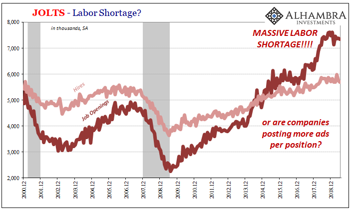
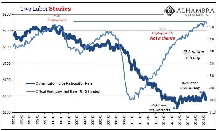
The purpose of this review isn’t to challenge or debate the assertion (again). That’s been done to death, and the data is uniform in saying Yellen had it all wrong (which should’ve been obvious by how 2015 unfolded). There are other explanations for JO’s wild, uncorroborated behavior.
However, even if you remain steadfast about drug addicts and Baby Boomers, that JO does present an accurate picture of a exogenously stunted economy producing a labor shortage, you have to be utterly dismayed by what’s going on in 2019. Outside of the unemployment rate, Job Openings have presented the best possible view on employment conditions.
Or had.
Judging by this second most charitable case, the jobs market is in trouble. According to these figures alone, demand for labor must’ve hit a wall (perhaps a landmine) somewhere around December 2018 (huge surprise, I know).
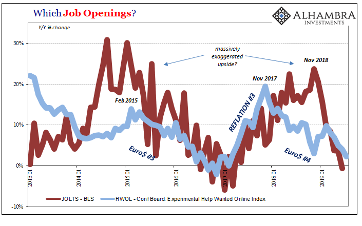
Alternate data picturing the same subject, figures from the Conference Board, for instance, had suggested a very different view of last year. Whereas the BLS would continue to feed data into the constant roll of anecdotes about some LABOR SHORTAGE!!!, these other estimates considered the economy already in a slowdown.
It no longer matters at this point. Both are now indicating the same thing for the same year at the same time. Whether more optimistic (JO) or more pessimistic (HWOL), the condition is now the same coming from each perspective.
The rest of the JOLTS data is the same way. The level of new Hires (HI) has likewise reversed for the first time since the end of the last labor slowdown following Euro$ #3.
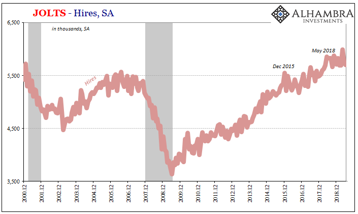
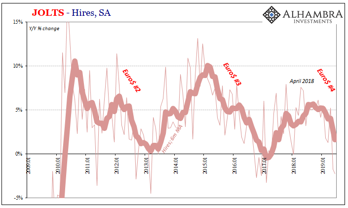
According to the latest estimates for the month of June 2019 (JOLTS is one month further behind the current payroll data), there were 2.2% fewer Americans hired than in June 2018. This followed a 1.7% year-over-year contraction in HI the month prior (May 2019).
From the point of view of HI, the economy of Reflation #3 was much less robust (for whatever reason you choose; the economy holding back the labor market or the labor market holding back the economy) but at least forward. Once May 2018 (something about the 29th) arrived, the condition changed and a level of caution emerged which has only become more serious over time.
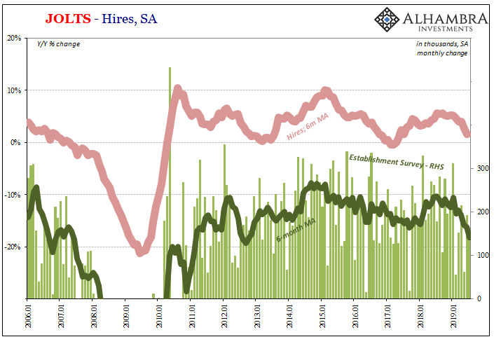
Like the headline Establishment Survey, which everyone still pays close attention to, the entire JOLTS survey data now suggests a weakening labor market. This change in direction is uniformly (in all the labor figures) indicated to have happened around the end of last year. From the (second) most optimistic set to some of the least (HWOL), there is no strength in the labor market.
While it certainly undercuts Jay Powell’s rate-cuts-are-insurance position, what most people want to know is – does this mean recession?
In isolation, the labor market data even enhanced by sudden homogeneity in JOLTS can’t tell you as much. What it does propose is that the risks of something like a recession are probably the highest they have been since 2009; significantly greater than they were in 2015-16 even though that was a relatively severe downturn in its own right.
After all, despite Yellen’s fixation on JO, Euro$ #3 did ruin the “best jobs market in decades.”
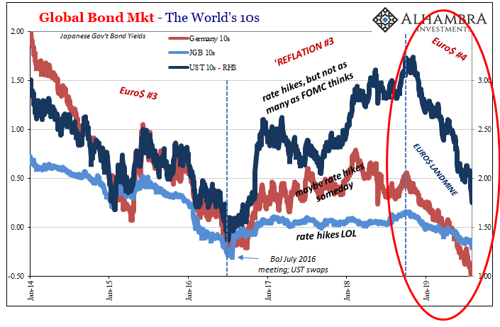
Euro$ #4 seems to have already one-upped its predecessor. It has now totally erased the LABOR SHORTAGE!!! And by all market accounts, it is just getting started.

Stay In Touch