
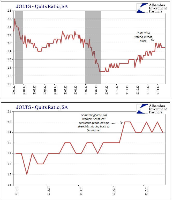
The BLS published its updated JOLTS figures for August last week, and while most commentary continues to focus on the ephemeral Job Openings category it shouldn’t. Though Job Openings declined sharply by just about 300,000 in the current estimate (from a slight downward revision of July) it still rates as completely out of alignment with the rest of the JOLTS series. New hires continue to stagnate this year, as has the “quits ratio” which would make sense under that hiring environment.
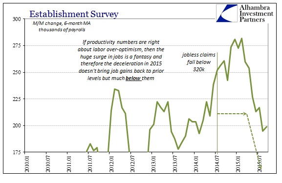
Worse, this inflection, without arguing to its proper setting and depth due to what are surely trend-cycle leftovers from its benchmark link to the CES itself, coincides exactly with the downshift in the Establishment Survey this year. Though they share that same statistical root, you have to wonder then what is truly driving the Job Openings segment of the estimates.

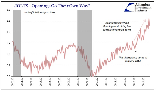
In that respect, we may be seeing exactly that subjective benchmark assessment being revealed via Job Openings. If there is a solid correlation between Job Openings and Hires, turnover and the Establishment Survey, as there should be (more on this below), the deflection in everything except Job Openings (dating back to around October last year) might suggest that subjectivity in isolation. From that, we can infer what might happen if Job Openings were thus “normalized” to the current picture of a clearly slowing labor market – hires, the Establishment Survey and turnover would not be stagnating but instead contracting to some unknown degree.

That is the setup I proposed with last month’s JOLTS release, specifically couched in terms of the Beveridge Curve, which I believe the August data offers only more confirmation. In short, I think that the BLS is trying to replicate the Beveridge Curve through Job Openings and expecting that the rest of the labor market would follow given the assumptions embedded within it (starting with the idea that there is a valid and sustained relationship between advertised labor demand and labor participation). I won’t reproduce that criticism here, expect to excerpt the concluding passage:
In fact, the Beveridge Curve as it “should” exist entirely disappears [using alternate labor participation], meaning that there is little or no relationship between Job Openings as they are in the BLS’s formulation and the unemployment rate that actually accounts for all potential labor. That distinction, I believe, is the central point here, namely that there are only two consistent interpretations. First, that the BLS has been entirely proper and that there is a surge in labor demand but that structural deficiencies are preventing full realization and thus that is the reason for what Janet Yellen sees and interprets as the mysterious “headwind” of slack upon wages (that are universally agreed to be still lagging and troubling).
The second interpretation is that the statistical relationships themselves have broken down sufficiently that the BLS is simply trying as best it can to conform to what is still believed to be “how it should look.” The primary clue for this interpretation is how all these measures truly depart right at January 2014, where new subjective benchmarks have been set under trend-cycle estimations not yet encumbered by benchmark revisions that will probably in time look like those that removed so much “growth” from 2012 and 2013. The fact that all these numbers (Job Openings, Est. Survey, GDP) might be doing the same at the same time derives from their statistical root, including how they are to some degree (which isn’t at all clear as it isn’t disclosed) derived from the same set of assumptions.
Again, as stated above, the updated figures for revised July and preliminary August fit within that context. On the unadjusted side, the Beveridge Curve still appears to be holding and valid; including instead a broader sense of labor participation that does not strip out long-term unemployed (those no longer accounted in the “official” labor force) reveals quite the opposite. There is no relationship between that more inclusive labor participation view and the statistical series of the JOLTS version of labor demand.
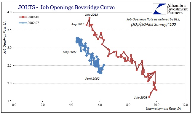
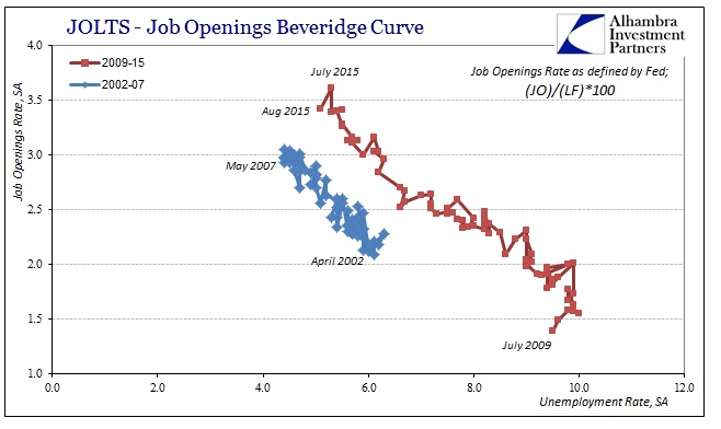
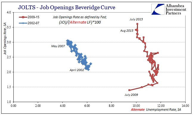
In short, the Beveridge Curve holds only so long as you ignore the participation problem, which economists are trying very hard to do; unfortunately the real economy holds no such luxury, especially with the problem getting only worse in 2015 with even the official labor force shrinking again (and the unofficial labor force thus even further out of alignment with the “recovery”). That leaves us with only the two possibilities described above, neither of which suggest anything truly positive about US economic function. Instead, given the trend in hires and turnover, it seems far more likely that the common and headline views about labor demand are again nothing more than statistical fancy. That would suggest that 2015 is significantly worse than it already appears – which instead of producing wholesale mystery about weakening sales globally would actually fit and corroborate the “unexpected” spending downturn.
Stay In Touch