
The Beveridge Curve was a useful guide for checking the intuitive relationship between the economic demand for labor and the actual use of it. Downward sloping, what it implies is that as more companies demand more labor the less unemployment there should be.
No duh, right?
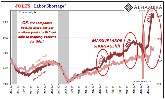
Because of this fundamental relationship, we might also use the Beveridge Curve in order to check the viability of the statistics which are constructed to measure these pieces of the economy. Picking up on yesterday’s jolt to JOLTS and what it might imply along these lines, the nagging question with regard to this series is and has been Job Openings (JO).
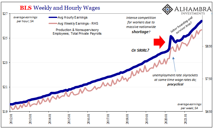
For practically all of 2021, JO has been the primary source of gasoline being poured on the fire that is the alleged LABOR SHORTAGE!!! Anecdotal stories are nice, and obviously plentiful again these days, yet here is some BLS data to put behind the stories seeming to support both their assertions as well as the hysteria accompanying them.
Quite bluntly, JO has gone nuclear.
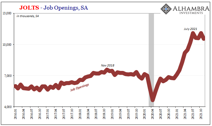
Is it real, though? Were the last two times JO spiked?
This is where the Beveridge Curve has come into play. We can go back in time many years if only to find the same questions. And it’s not just me, here’s the Wall Street Journal wondering where all the hiring was in 2016:
The number of unemployed workers per job opening has fallen to 1.3, the lowest since 2001. What would normally sound like good news—abundant jobs—is tempered by the fact that people simply aren’t being hired into the positions at rates like in the past. About 300,000 fewer people are being hired each month compared with the pace reached in February. And during the entire economic recovery, the U.S. has yet to notch a month of hiring that matches the pace seen at the heights of the middle of last decade or the early 2000s.
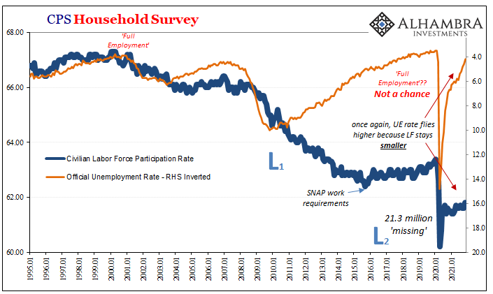
Economists and central bankers have appeared to relish blaming America and American workers; too lazy to reeducate themselves or retrain in some way, along with too many addicted to opioids. They initially tried to fault Baby Boomers somehow choosing 2008 as the perfect time to retire before participation rates among older workers proved this false.
In other words, JO implies the level of demand for labor must be through the roof while the actual use of labor is, well, not. For policymakers seeking any explanation which doesn’t finger their failures, QE’s most of all, you can see why they’ve been addicted to the drug use theory.
But couldn’t it instead be true that there is something screwy with JO? Maybe, just maybe it is overstating the true level of labor demand, perhaps the economy and labor market not so great all along.
Furthermore, if this was the case then Economists might then have causation in the workforce backward; the opioid crisis, among other growing social and political ills, each results of an economy that won’t reignite, failing to recover year after year leaving America’s poor out-of-work left behind to the dreariness of destitution, government dependency, thus other kinds of dependency on top. 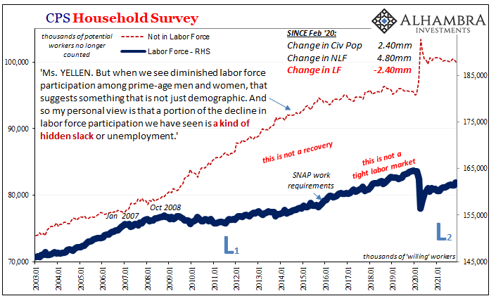
 Let’s back up and go through the Beveridge Curve. What is it? Here’s what I wrote more than six years ago when it first started to pop on the mainstream radar following what was supposed to have been 2014’s “best jobs market in decades.” This from 2015:
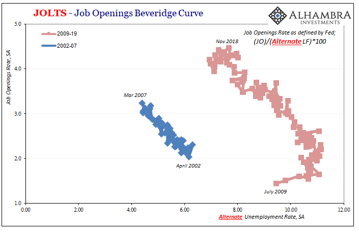
In the 1940’s, William Henry Beveridge devised a method to try to estimate any such structural economic changes by comparing the unemployment rate to some measure of generic job openings (Help Wanted ads in those days). The Beveridge Curve asserts that very relationship, meaning that there should be an inverse relationship between unemployment and Help Wanted. Plotted, this association and correlation should follow a downward sloping line where the X-axis is the unemployment rate and the Y-axis some version of business demand for labor.
Simple, right?
Well, labor demand isn’t just JOLTS JO, it has to be converted to a rate which puts it in the same terms as what goes down on the Y-axis. The BLS uses one way of coming up with a Job Openings rate (as a percent of all those the BLS figures are on a payroll) while Fed researchers have deployed a different one (job openings as a percent of the official labor force). 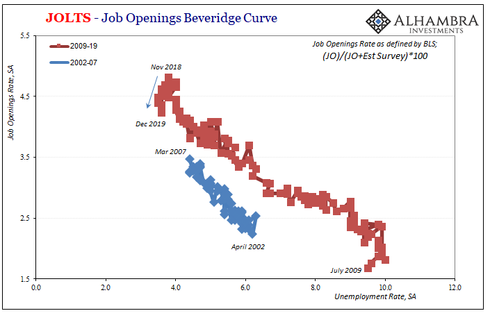
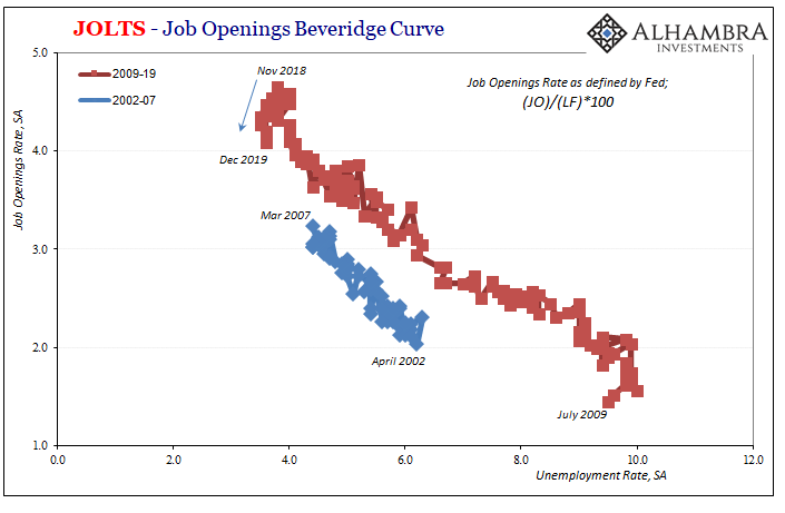
Both largely agree with the picture of labor demand compared to probable use and right there’s our post-2008 problem; the Beveridge Curve has quite obviously shifted outward. What does that mean? I’ll reuse what I wrote when revisiting the topic in 2018 amidst that era’s Inflation Hysteria #1 and its own anecdotal LABOR SHORTAGE!!!!
An outward shifted Beveridge Curve is one that in its constituent pieces implies a higher general level of Job Openings for a given unemployment rate. In real terms, that would suggest businesses have to advertise more for the same amount of labor market utilization (at least as described by the unemployment rate or the official tally of whoever counts as unemployed). You can start to see why policymakers have turned to the opioid crisis as a potential explanation since it is at least a structural labor issue that could, in theory, produce just such an outward shift for the Beveridge Curve.
But it is not the only explanation, nor is it the only problem we find here. One possible alternate factor might be, as strange as it may sound, shyness. There is nothing that says Job Openings is the definitive measure for labor demand (not even economists would claim as much). You can easily imagine a set of conditions where businesses might freely advertise for labor but at the last minute refrain from pulling the trigger in hiring whomever responded to the advertisement.
In other words, it’s pretty easy to concede given the experience of this “recovery” that in times of heightened economic uncertainty firms could still list Job Openings (that might even be actually open) but fail to complete the process due to unusual hesitation. The longer that economic uncertainty persists, it might even become normal for this kind of change in behavior, to almost poll prospective labor market candidates (especially if Job Openings were very cheap and easy to use) in regular fashion without the same commitment to hiring.
Rather than the mainstream view of companies overly eager to hire yet unable to find workers, this explanation instead indicates companies aren’t actually eager at all (thus why, you know what’s coming, they’ve been so unwilling/unable to pay the market-clearing wage) so prospective American workers remain on the sidelines out of the workforce and, for far too many, seeking some kind of salve (drugs, political extremes, etc.) for this never-ending economic pain; opioids haven’t been holding a robust recovery back, rather economic pain from lack of recovery has pushed untold millions to destructively seek self-medication.
Given the Beveridge Curve’s sharp shift post-2008, you can probably already guess what happened to it following March 2020.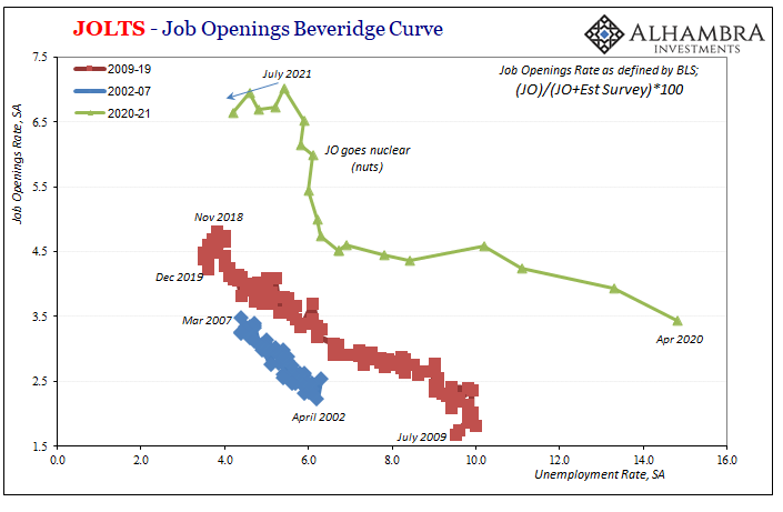
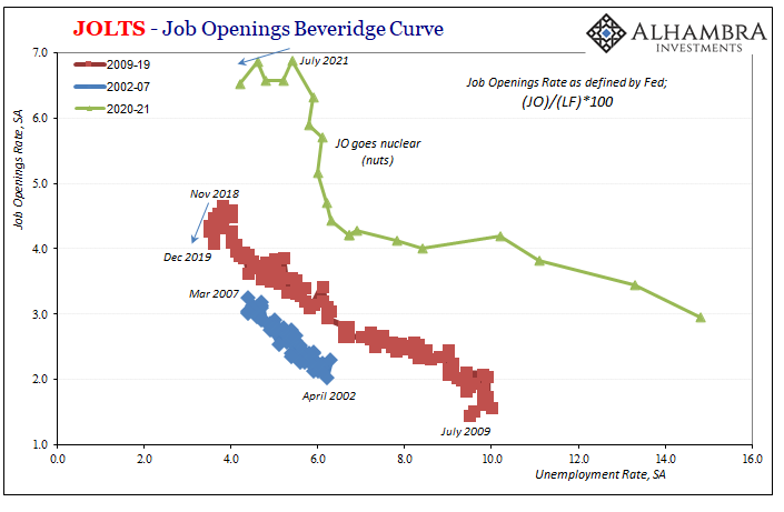
Shifted even more outward; so much more it’s actually quite ridiculous. There’s still the downward slope, that’s good, but the supposed or expected intuitive relationship between the measure of labor demand (some form of job openings rate) and the mainstream metric for labor use (unemployment rate) is even more out of whack.
Does this make JO more reliable, or simply raise even more questions about its construction, use, and then interpretive value?
And these curves use the standard BLS unemployment rate or its official labor force to come up with the utilization number for each X-axis.
Back years ago, I came up with what I still believe a more consistent metric which at least tried to account for the participation problem, and in doing so this only shows just how far unaligned, detached these curves have grown since, oh, early 2009. The alternate 2009-19 curve is hanging out even farther outward.
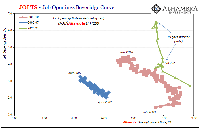
One constant in all three of the curves for 2020-21 is how they haven’t been curves much at all since last January; most pronounced and most obvious in the alternate version. At least before then, the green line alternate was in the vicinity of its 2009-19 neighbor (immediately above).
All of the green lines went practically vertical for the first seven months of 2021 when Job Openings data went straight up.
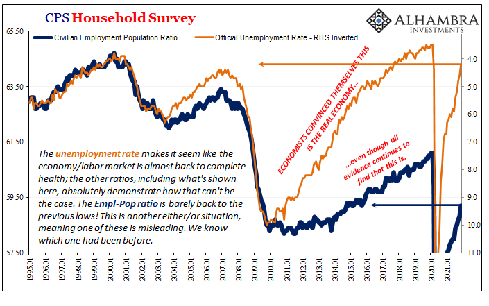
At the very least, this tells you in very strong terms to question JO and not take it at face value given how even the highly favorable unemployment rate can’t come close to matching it! In the mainstream, the inflationary LABOR SHORTAGE!!!! is constantly put forward as the only explanation possible, the only way to interpret labor market data.
Trust the Fed’s verdict.
That’s not true, nor has it been for many, many years. In this sense, nothing has actually changed; not in 2021, either. If anything, the problems have gotten worse – data incongruencies along with very likely the real economy problems responsible for them.
Companies appear to advertise for work, but won’t pay or even hire when the time “comes.” The next step would be to figure out why (see: October 2008 and how it was right then the Labor Force changed).
The latest FOMC minutes published this afternoon show just how “hawkish” the Fed has skewed. Not because of last year’s CPIs, but for what officials believe (without having any way of figuring the monetary system) is a deadly combination of rising inflation expectations coupled with what their models employing direct numbers like JO (Yellen’s “inflation dashboard”) tell them is an increasingly tight labor market.
It’s just that the “labor market” is “tight” if in the same exact ways it had been the last time(s) the FOMC was so hawkish. If not more so (misleading).
Stay In Touch