
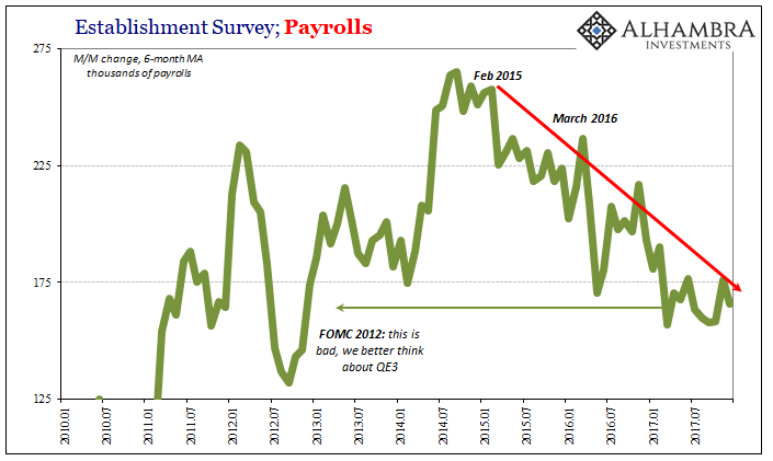
Last year was an objectively bad year for American workers. The latest payroll figures from the BLS for December 2017 fill out what was an awful picture. According to its Establishment Survey, the data that’s taken as the definitive source on the US labor market, total payrolls expanded by 2.055 million in 2017.
That annual increase isn’t being lamented, however, it is widely celebrated as proof the economy is in good if not great shape – though much can depend on how you view the current occupant of the White House. The rough condition of the overall economy and its effect on jobs in America really has nothing to do with politics aside from bipartisan denial.
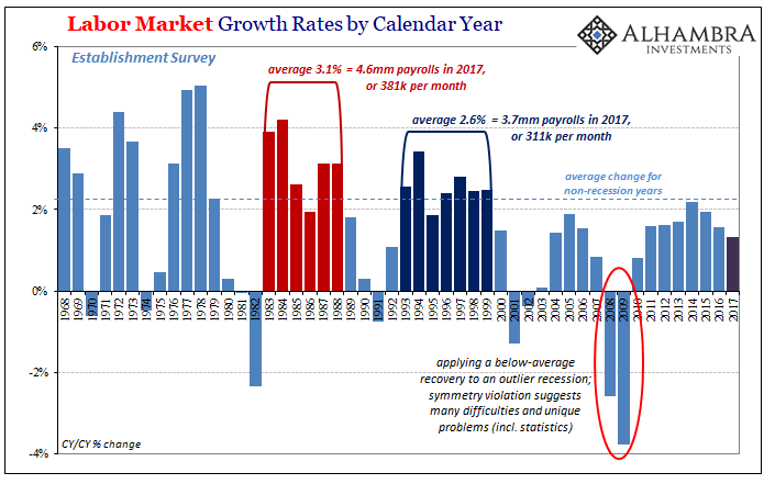
Last year was the worst year in payroll gains since 2010. Set aside all the highlights of that 2.1 million figure, what really matters is in percentage terms. The BLS estimates as of right now (benchmark revisions are coming for next month, FWIW) show that the level of overall employment increased 1.31% in 2017 over 2016 (December to December). To put that in perspective, the Establishment Survey gained 1.6% in 2011 despite a renewed breakout of near-panic in global markets, and has averaged 2.2% growth (non-recession years) going back to the fifties.
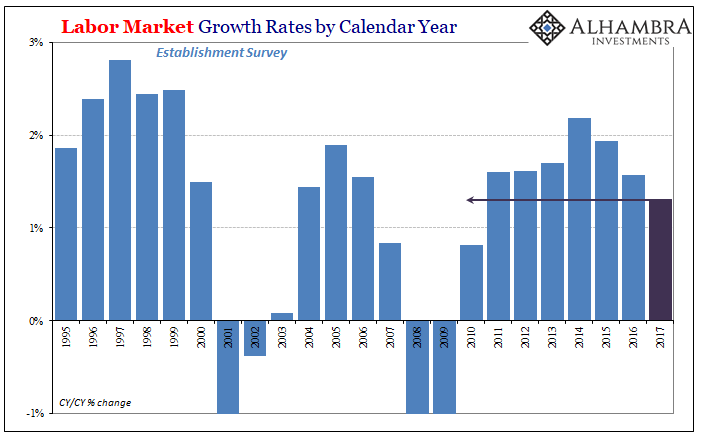
It is nothing like the labor market of the 1990’s and it’s not even close. Despite constant descriptions making it seem like the economy has reached positive circumstances similar to that period, to be at all comparable payrolls should have expanded by at least 3.5 million last year if not 3.75 million. At 2.1 million, again, we have to conclude the US economy remains in a very weak state. There really is no other legitimate interpretation.
The reason we have to conclude that is not due to one particular month of estimates, nor even those for a single year. The bad year in 2017 for the labor market is merely confirmation of what has been ongoing for a very long time, predating, even, the Great “Recession.”
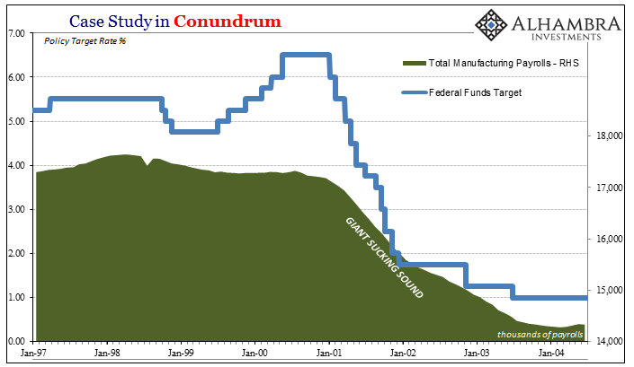
You can see it on the chart above pretty clearly, the shift right at the start of the 21st century to something else unfamiliar to prior economic history. The contraction starting in late 2007 was simply where things really got serious in terms of labor utilization in this country; where the difference between earned income and that supplemented by massive debt growth really started to show up.
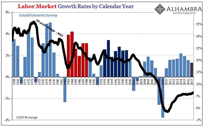
If we use a length of comparison along the lines of something like Robert Shiller’s Cyclically Adjusted PE, where stock market earnings and prices are stretched out over ten years to reduce the noise of recessions and other short-term distortions, we end up with something like an inverted labor market CAPE.
The 10-year change for the Establishment Survey, appropriately calculated in percentage terms, started downward below all historical precedence coincident to the dot-com recession. It wasn’t really that cyclical trough that did it, however, more so the “jobless recovery” that followed especially in the years 2002 and 2003 – those where manufacturing jobs disappeared by the hundreds of thousands, and eventually by the millions.
In other words, the US economy has never recovered from the loss of its manufacturing base, merely papering over it originally with a housing bubble fueled by massive offshore money growth (which, incidentally, at the very same time financed the flight of US manufacturing to largely emerging market locations).
The eurodollar collapse starting in 2007 simply took away the debt supplement here, as well as whatever benefits (there were some) spilled over from increasing globalization and rapidly rising trade. It was that which had a more profound effect on the labor force itself, confusing economists into thinking Baby Boomers or opioids could ever explain what you see above and below:
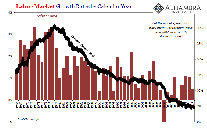
In terms of demographics, there was an obvious change coming out of the seventies, a time in which women entered the workforce in record numbers. The slowing of labor force expansion afterward wasn’t any problem for the US or world economy in the eighties or nineties. What followed 2007, starting for the labor force at the worst in 2009, was not demographic but easily attributable to what happened in that time – monetary panic.
It was following those events that American workers became fed up with looking for work that just wasn’t available. How do we know? This:
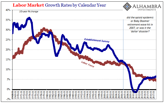
The difference between those two 10-year comparisons is a long-term, CAPE-like unemployment rate – only adjusted for growth rates rather than being a static, non-scalable metric as the current unemployment rate has to be. What I mean by that is what you see above at the far right (2015-17) is perfectly consistent with a very low unemployment rate, but that low unemployment rate is still nothing like we have ever seen before. It is meaningfully worse for what’s left out of the denominator (labor force), of course, though the full scope of the problem goes way beyond just on the bottom of the ratio. The numerator (the 10-year trend for the Household Survey is slightly worse than the one for the Establishment Survey) has also been severely depressed.
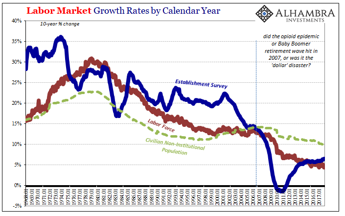
And we can further eliminate population slowing from consideration as a possible explanatory factor. Population growth has slackened in recent years, but it is nowhere as dramatic as what we can observe in labor market conditions.
The December 2017 payroll report really hit the trifecta of awful – bad month, bad year, bad decade. But if you never get past seeing the month, or the year, as anything but good to awesome, you can only ever be confused about what’s happening and why. The economic problem is a big one, one that doesn’t easily fit into something like Payroll Fridays. That’s surely the main reason for a lot of this; it’s almost too much to grasp, and for most people accustomed to only economic growth it is an assault on basic modern assumptions.
As I wrote yesterday, one of those assumptions is that any period of stagnation or malaise has to end. In truth, there is nothing anywhere that says that it does; depression can go on for as long as whatever caused it remains a relevant condition or factor. That’s really the point of this exercise, indeed looking at any data objectively. We need to identify whether or not something has actually changed before we can ever begin to think about its possible transition to something appreciably better.
A seriously decelerating labor market dropping down to 1.3% calendar year growth is alarming beyond the longer-term, baseline question, and therefore doesn’t even begin to suggest a breakout to a non-depressed condition. That’s doubly true for a year, 2017, that was supposed to be the very opposite, the inarguable start of acceleration toward those better days.
Stay In Touch