
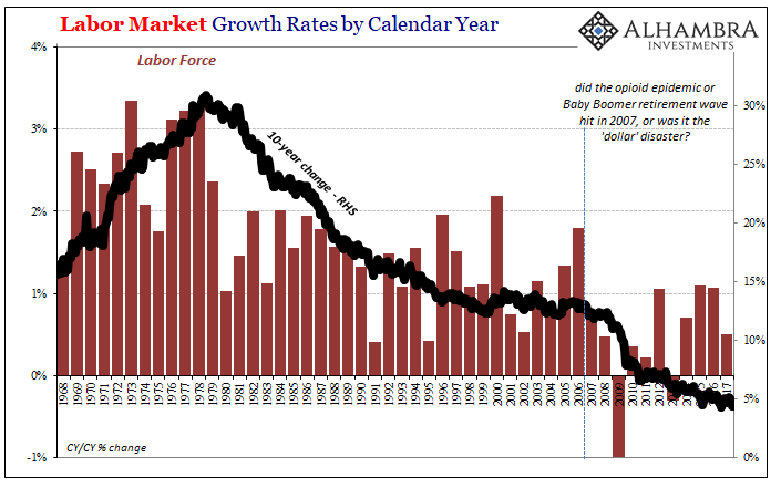
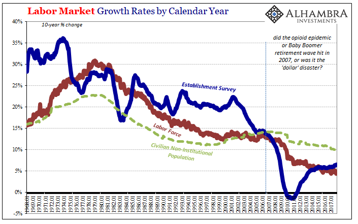
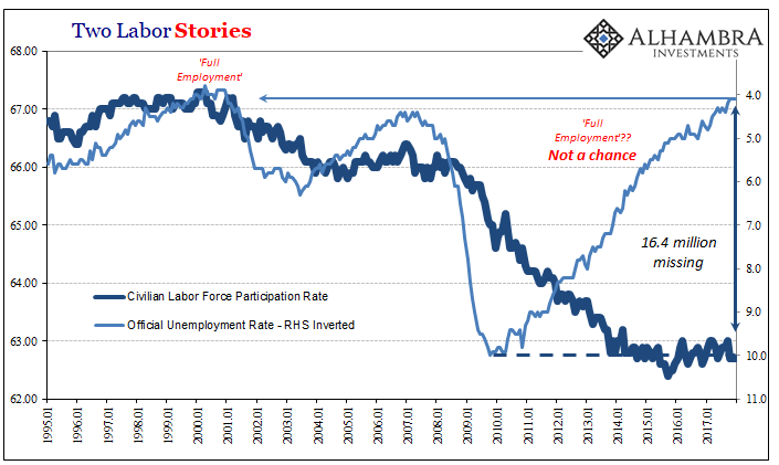
In 2017, the BLS estimates that just 861k Americans were added to the official labor force, the denominator, of course, for the unemployment rate. That’s out of an increase of 1.4 million in the Civilian Non-Institutional Population, the overall prospective pool of workers. Both of those rises were about half the rate experienced in 2016.
While population growth slowed last year, it produced, apparently, an almost constant participation rate. That suggests either statistical “fitting” or the same labor market conditions nowhere near strong enough to entice the millions (as many as 16.4 million) sitting outside the official definitions.
It works out to labor force growth averaging about +72k per month last year. Going back to March 2016 (the last month of SNAP work requirement waivers being pulled), the labor force has expanded by just +64k per month. These are, as noted earlier today, grim figures way, way out of the historical norm. Given the timing for when it started, it’s not drugs and gray hair.
It further undermines the unemployment rate, though that isn’t news. The official estimate has been at or below 5% for 27 straight months; it’s been 4.5% or less each of the last ten months of 2017.
By now it should be clear enough that the current 4.1% is a calculated number and nothing more. Like the old computer programming adage, GIGO remains an appropriate expectation (garbage in, garbage out). It’s a very poor basis for more than inflation expectations. Indeed, the FOMC is voting on symbolic “rate hikes” as if any day now the unemployment rate as it is stated will suddenly switch over to relevant.
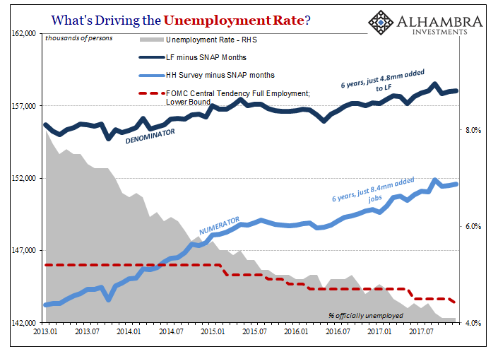
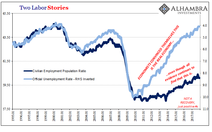
But it’s not just the denominator that’s the problem with the ratio. The top of the fraction has been growing faster than the bottom, to be sure, producing its quickening downward trajectory, but that doesn’t necessarily mean it has been growing fast. It hasn’t. The result is wage growth that remains suspiciously subdued for the fourth year in a row.
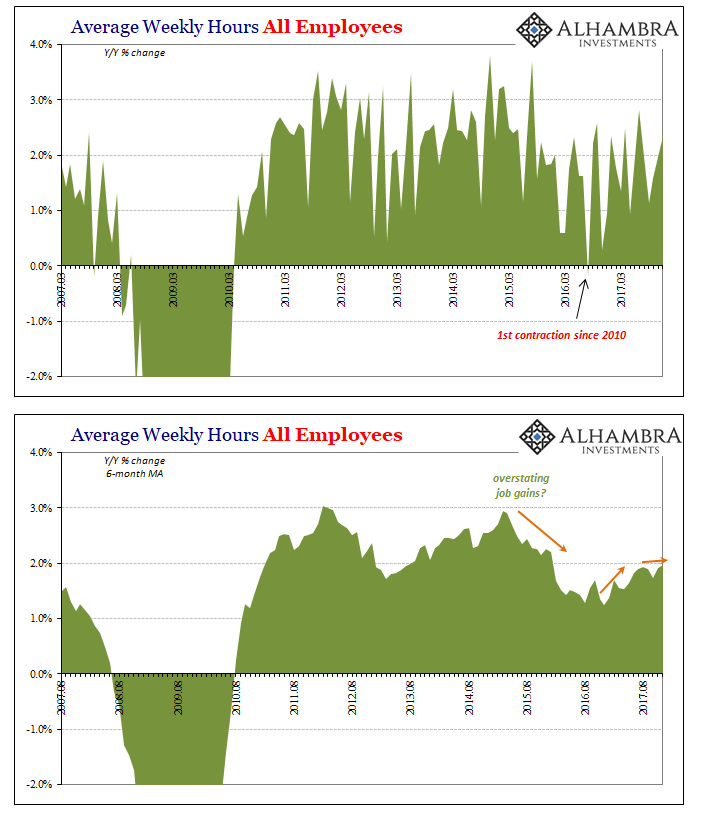
Of the acceleration in average weekly earnings in 2017, all of it was due to a rebound in total hours worked rather than the anticipated end of slack and competition for workers. Employers in response to the “rising dollar” downturn not only cutback on hiring (as well as capex), they ever-so-slightly reduced the hours of the remaining workforce, too. The initial result was deceleration in weekly earnings right at the moment (early 2015) the unemployment rate broke through the FOMC models’ expectations for what should have constituted “full employment.”
It makes all the rest incredibly simple. The lack of labor force growth going on nearly a decade now means that in every likelihood there remains a deep pool of American labor from among which Americans would work if there was any (at the margins) to be hired at a decent rate. Couple that with what appears to be the rebound in hours falling short of recovery (as suggested by alternate data, such as revolving consumer credit), the result is for Economists a Phillips Curve nightmare; the unemployment rate falls on their charts but no one who matters cares enough to hear it.
What follows from there is everything captured in the dramatically flattening yield curve; the FOMC changing monetary policy references based on future growth that just isn’t indicated anywhere dead against what was clearly another lost year for labor. You get enough of those in a row, like we have witnessed, and no wonder the long end of the curve won’t budge no matter how low the unemployment rate might travel and how shrill Economists and other “experts” become in their expectations for what that’s supposed to indicate.
Economists are fooling themselves chasing a circular shadow of subjective bias – that the malaise has to end because there has to be an end to the malaise. There doesn’t, and the full range of data contained within the payroll reports for 2017 proved yet again that continues to be the case.
Stay In Touch