The boom never boomed. That’s what made the bond and money curves so flat in 2018. The data, the real economy behind the numbers, never matched the rhetoric. Even GDP. We’re in much the same position today, only starting from much weaker and worse. The rhetoric is still positive, except now it’s about a turnaround.
But, and this is the same big “but”, at some point the turnaround actually has to turn the economy around.
There was a lot of disquieting information contained within this week’s release of the GDP numbers. Imports, the inventory cycle, capex; even high-tech capex. A growing catalog of parts suggesting the economy is not just leaning the wrong way perhaps accelerating in that direction. As I wrote, three straight quarters of growth at the same growth rate could not have looked more different.
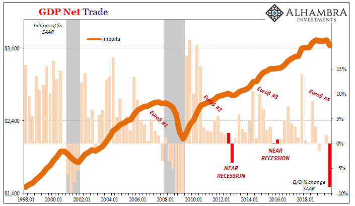
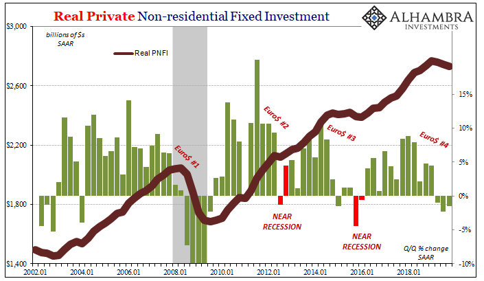
By its nature very, though, GDP is backwards-looking. Sure, we can make inferences about how once things start turn toward one direction or another they tend to stay moving in that direction for some time. Kind of like momentum. Is there a way we can figure out from within GDP what those tendencies might be?
Fortunately for us, researchers in the eighties researched various ways. What they came up with was something called the Duncan Leading Indicator (huge thank you to M. Simmons for crunching all the numbers and even unearthing some of the original literature, in other words doing all the real work for me). What’s that you ask? The San Francisco Fed in 1985 described it this way:
The Duncan leading indicator is the ratio of consumer durables spending plus residential and business fixed investment to final sales, with all data adjusted for inflation. Final sales are defined as the gross national product less the change in business inventories. Thus, the indicator is the ratio of the cyclical components of expenditure to GNP, except that the change in business inventories has been subtracted from both the numerator and denominator.
Exactly the parts of the GDP data that we’re interested in. After all, if generally cyclical problems show up, history shows they’re likely (not always) to manifest and propagate until an actual cyclical peak is created (recession).
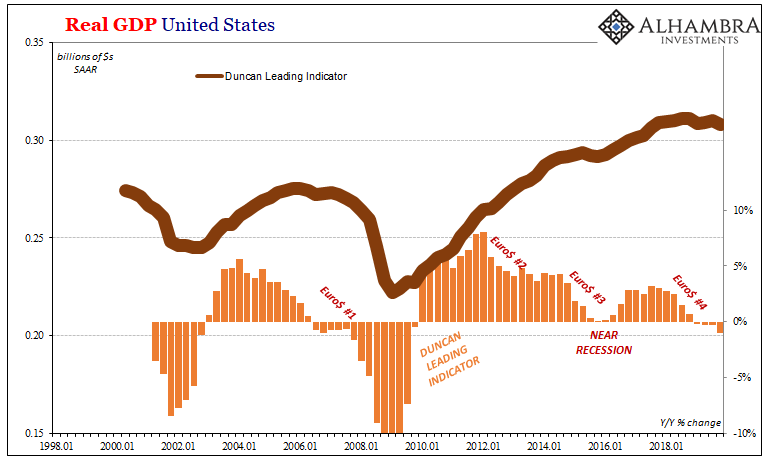
With the latest GDP estimates in hand for Q4, the Duncan Leading Indicator suggests to us the economy just might be heading for its peak. The year-over-year change in it has now been negative for all of 2019 (which, not coincidentally, matches the behavior of the yield curve dating back to around November 2018), with that comparison accelerating on the downside particularly over the last three months of last year.
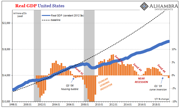
The fourth quarter, you will remember, is the one when everything was being turned around in the right direction. That’s what everyone said. A global flood of dovishness combined with trade deals and, I don’t know, aliens buying stocks or something. Whatever it was supposed to have been, they said it was really, really good.
The evidence, though, continues to be lacking. The data points to an economy coming toward the end of last year the wrong way and the forward-looking numbers suggest that will continue. The economic direction, the risks, remain decidedly on the downside. Duncan says, possible recession if it goes further.
This obviously isn’t the only leading indicator out there. Others aren’t nearly so pessimistic. One that is widely followed, put together by the Federal Reserve’s Chicago branch, isn’t close to flashing the same recession warning. The Chicago Fed National Activity Index had leapt up to +0.41 in November 2019 (revised substantially lower) only to drop to -0.35 in December.
A positive number denotes economic growth likely to be above trend moving forward; the more positive, the higher above. Negatives mean the opposite, but not necessarily recession. Below-trend growth can become a lot of things, from minor slowdowns to near recessions and whatever possible economic gradation lies in between and around them.
This one’s particularly noisy so you have to go by the average. Historically, when the average index value gets to as low as -0.60, that’s when you generally see recessions close ahead. In 2019, up through December, the average remains pretty consistent in a range around -0.20 to -0.30.
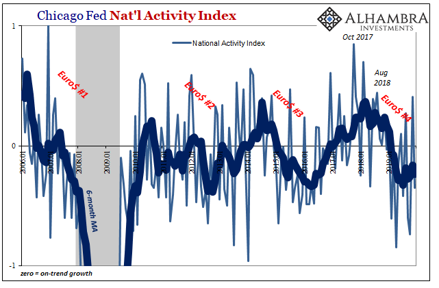
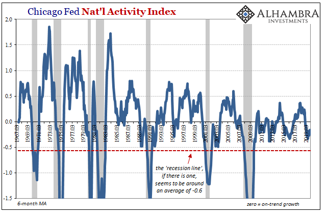
This suggests, then, that looking ahead the economy will stay below trend in probably the same way it had during Euro$ #3. Compared to a possible recession, that sounds potentially encouraging.
It shouldn’t, though. Remember our purpose here is to first try to figure out the prospects for an economic rebound – the condition that Jay Powell says is the most likely case. Richard Clarida’s contention that global headwinds and disinflationary pressures are abating. In our own jargon, the end of Euro$ #4 and therefore no more of its painfully negative influence on the global and domestic economy.
Neither the Duncan Leading Indicator nor the CFNAI agree with that. The best case, the CFNAI, indicates further below trend growth over the near term that is probably consistent with the trough of Euro$ #3 – which was itself nearly a recession. That’s the high side.
On the other side, the Duncan, cyclical forces are already in the works and there is a non-trivial chance the ultimate bottom of Euro$ #4 looks more like the classical recession.
These two indications, then, bracket the range of probabilities we might best expect for the economy moving forward. That range doesn’t come anywhere close to a rebound.
In short, Euro$ #4’s very likely not done. Not yet. What that ultimately may mean is still up in the air, but if its likely topside or best case ends up with more economy like Euro$ #3, small wonder how the bond market is trading. Pandemic or not.

Stay In Touch