
Score one big one for Governor Waller’s taper checklist. This particular FOMC member had, just a few days ago, speculated on continued large gains in US payrolls. A couple more on top of the last one, that being June, and it was his position the Federal Reserve would have to begin to seriously consider shifting course.
He doesn’t mean to say the existing interpretation of recent US (only) consumer price data is wrong, rather it would be superseded by recovery events. In the case of continued near-million payroll months, this would seem to indicate using up remaining macro slack so quickly, demanding a shift in policy since labor market overheating would then, in the textbook view, greatly enhance the risks of this transitory supply shock and their artificial factors becoming more realistic and more serious inflationary pressures.
These past few unnerving (to some) CPI’s and deflators are all about supply and demand imbalances, therefore the central bank viewing them as “transitory.” If, however, the labor market closes the remaining gap still leftover from last year’s recession, and it does so quickly, then there’s some real inflationary potential (according to the Economics textbook which the Fed uses).
Today’s Payroll Friday ritual granted half of Waller’s “wish.” The published monthly change for July 2021 basically equaled the upwardly revised June estimate: a headline gain of 943,000 compared to the 938,000 during June. Taper, according to Waller, is that much closer to finding itself on the table.
The taper table.
And that’s all fine and well for the mainstream to fill up pages of discussion and seed more than a little click-y drama into it. The actual economic (small “e”) matter, and to Waller’s credit what he was really talking about, was really two parts to the labor market condition: one mainly known; one as yet not.
The first which is quite well documented is that leftover deficit. Confounding and contrary to last year’s shouts of “V-shaped” recovery (remember those?), the US labor market isn’t hot or anything of the sort. It is instead several millions short of the prior peak (by how many millions depends upon which data series you prefer; more on this below) even now more than halfway through 2021.
And the longer this goes on, the deeper the hole because we also have to factor the many millions more jobs that never got created (above). It is shaping up more like 2010-11 than not.
The taper argument, or argument in favor of taper (which already presumes that QE is being “accommodative”, an absurd and disproved idea in fact if not in media writings; but that’s another topic), is that if the economy and labor market’s climb out of this hole materially speeds up then this raises the chances of not just making it back to even much sooner but then going too far, too fast beyond into “overheating” due to what would then be a tight or extremely tight inflationary labor market.
Yes, nearly the same situation as 2018 revisiting many of the same arguments and expectations.
And the problem with them begins with interpretation problems before settling back into measurement problems.
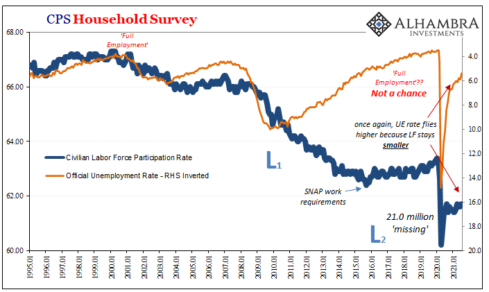
Taking the former first, the Establishment Survey alone may make the acceleration argument. Most (all, actually) of the rest of the labor data does not. Even the Household Survey, which, as expected, bounced back in a big way in July, on average is substantially slower than recent payroll growth on average.
According to this other, the CPS, the Household Survey increased by 1.04mm in July alone. This after falling by 18k in June (HH is typically noisy and the monthly estimates don’t get revised until benchmark time). Despite its very sizable rebound, the 6-month average is just 436,000.
Going back to October of last year up through this current update, the overall increase in employment (CPS) was 2.98 million for an average monthly change of just 331,000.
The 6-month average for the Establishment Survey (CES) is a much different 681,000. 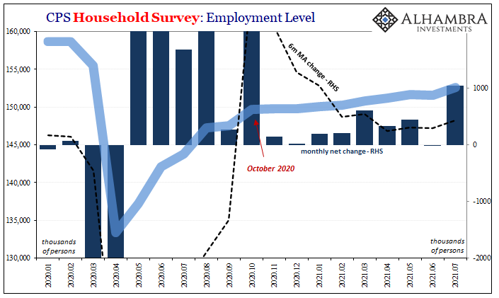
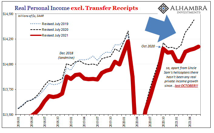
As you can see above, quite clearly, the HH Survey comes in much closer to the BEA’s (ridiculously) revised private income series (Real Personal Income ex Xfers) right down to the month of inflection/slowing; both go sideways, meaning steadfastly slower not faster, right on October 2020.
That’s not all, if we look at the hours index (aggregate hours worked), while the year-over-year changes continue to be huge (base effects) we can “correct” for that particular statistical distortion in the same way we’ve done so for Chinese data; 2-year changes at annual rates.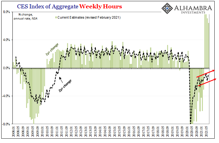
Not surprisingly, given the other labor series beyond CES, what we find is both a persisting slowdown in the pace of “recovery” as well as the same month of last October for when it seems to have begun.
Then there are the jobless claims tallies. We’ve covered these on several occasions, using them as a sort of off-brand test for possibly significant discrepancies between these major BLS datapoints (the other JOLTS). For the first time since the recession last year began, the two stated here aren’t even in the same neighborhood any longer.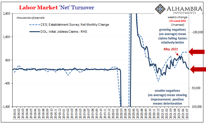
We certainly don’t expect them to match perfectly or anything like that, but we have reasonably come to anticipate each remaining in the same ballpark; the jobless claims average suggests headline payrolls in the 300k range whereas it was instead more than 900k for the second month in a row.
In many ways, this, again, is merely repeating the 2018 fallacies when back then officials were quick to extrapolate from a single headline source, the unemployment rate in that case, a labor market acceleration which was never corroborated by anything else in the government’s data let alone the general marketplace.
Like then, a broader, more complete employment survey would’ve argued at least caution about any inflation/recovery expectations if not spoiling them entirely.
If there is a difference in 2021 as compared to 2018’s discrepancies, it is from what condition all this is coming about. Three years ago, the economy and labor market were both still in their own deficits (output gap never closed in the former; participation rate for the latter) but nowhere to this degree.
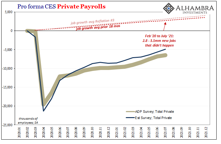
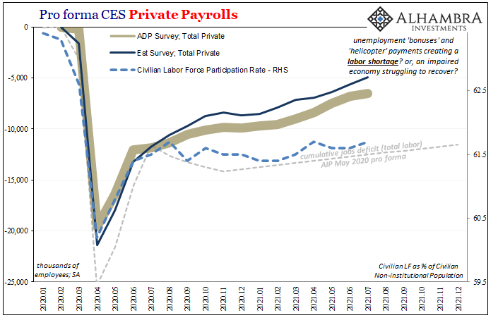
While we know it is much deeper and more serious this time around, there’s a growing divergence in measurements of this deficit, too. For example, in terms of private payrolls the BLS put July’s gain at a robust 703,000 whereas ADP, the private payroll provider, had earlier this week guessed just 330,000. Each of those tally a growing distance in this key dimension.
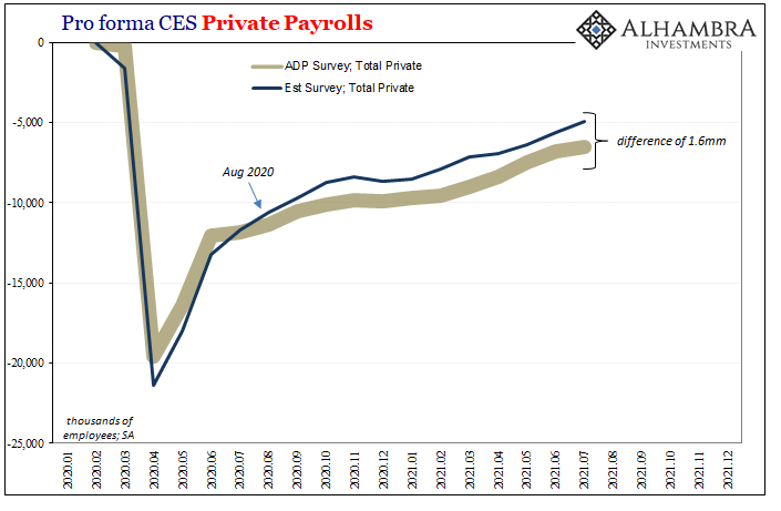
As it stands after all the July numbers, the Establishment Survey’s estimate for private payrolls is 1.6 million closer to closing the recession gap than ADP – even as, last year, these positions were flipped.
Even more important, you can see just where the two began to disagree on recovery speed – specifically August and September leading into that same month of October 2020 which has already shown up in all these other parts.
To sum it all up: much faster labor market acceleration from a smaller gap; or slower from possibly much bigger.
FOMC members, Jay Powell in particular, fell too much in love with a single feature labor measure – to the exclusion of so many others which would have far better informed the central bank of the real economic state. It was much weaker and less potential than otherwise believed, therefore the downturn rather recovery which followed was always a much higher probability.
Far less inflation potential at any month or time; a lot more of the other kind which, in fact, is what happened.
Is this time going to be different?
Headline labor data will headline the taper table, though neither of those seem very likely to mean anything substantial. As the “dot bump” in the eurodollar futures curve earlier this year, there is a slightly raised possibility the FOMC will fool itself into tapering maybe even a rate hike, but – back end of the curve – it won’t make a lick of difference because of all these reasons stacking up under the table.
Stay In Touch