
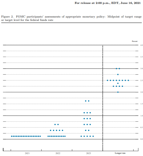
So much easier to just change the target, to move the goalposts. Having failed for weeks to provoke any “tantrum” to the Federal Reserve’s oncoming taper, even before today’s FOMC meeting all attention was instead simply shuffled off tapering QE and onto rate hikes. Bring the dots back! Anything to keep up the idea the Fed is a central bank in control of money stuff.
A single dot maybe two get moved and we’re told to consider this terrific optimism and terrible hawkishness (if you are holding safe and liquid). It doesn’t matter, apparently, that we just went through this barely two years ago and it didn’t work out so well for either the dots or the hawks who plot them.
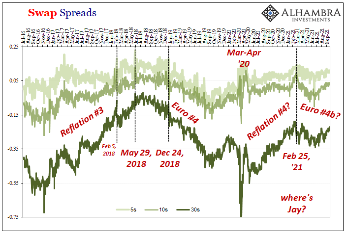
Early in 2018, March to be specific, Jay Powell’s early tenure was marked by increasing hawkishness from then onward. You could already tell at that early stage – markets were increasingly priced beyond skeptical – how Powell’s FOMC was in trouble:
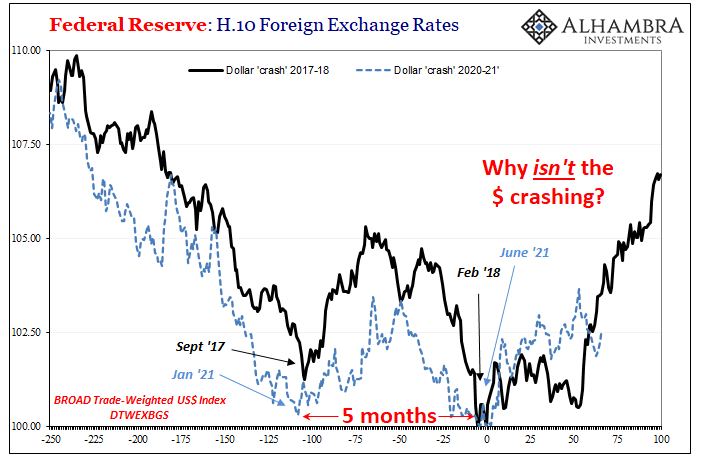
Monetary authorities can’t answer basic questions about inflation and wages, but they are optimistic anyway for reasons they also can’t really explain. They appear almost certainly to be following the dollar…That they have no idea how or why it falls, and therefore if or how it might once again reverse, is for the last decade a given.
The dollar had been moving down throughout 2017 as modeled projections for growth and inflation began moving up. Already by March 2018, though, the dollar stopped going lower while the dots kept going higher. Why?
In Europe, then-ECB Governor Mario Draghi was more honest; he said inflation was going to pick up because that’s what they projected despite there being no evidence this was actually happening. Sort of an article of faith, quite different from what the textbook says.
This is why I keep writing that the burden of proof falls on these people, these Economists. Time and again, their dots say one thing only for them to fail and not all that long thereafter. If you got the last one wrong, as well as the one before then, shouldn’t you have to explain why you got it wrong first especially if your claim today is that this time will be different?
Just a year after what I wrote above, by March 2019 it was entirely too easy to update that with the following:
Forget the “dots”, they are the meaningless expressions of statisticians who unrealistically forecast their own reputations. This thing, this other economic thing, is really starting to get serious now.
That last part is where the absence of tantrum in 2021 really stings. Ben Bernanke’s taper at least had some concurrence to it; the bond market, for a few short months, anyway, had begun to more seriously ponder Bernanke’s conclusions. Maybe the economy really would be improving beyond the simple absence of further contraction.
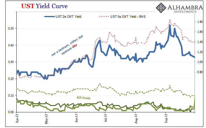
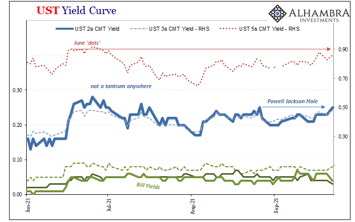
The front end Treasury notes demonstrated as much: the 2-year UST yield went from around 22 bps before the “tantrum” to upwards of 50 bps by early September 2013. The 5-year leapt from less than 70 bps to more than 180 bps in the same few months.
Ever since taper was first introduced in 2021, however, the same shorter end UST notes haven’t budged. And it doesn’t really matter where you begin the look-back, which specific utterance of the word “taper” which was supposed to have entranced and then enraged bond investors.
Looking back to when Mr. Powell appeared at the virtual Jackson Hole on August 27 and himself used the word taper, the 2-year note yield is…unchanged; the 5s up 2 bps.
Go back to the middle of June when the issue of these hawkish dots first made their reappearance (along with the RRP +five). Again, the 2-year note barely moves, an insignificant equivalent of a market fluctuation (+2 bps), while the 5s are actually slightly lower.
Neither dots nor taper are capable of moving the curves. So, what is?
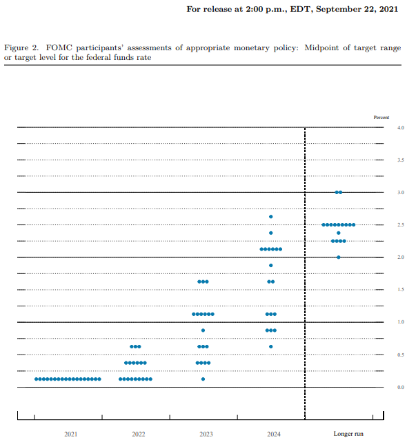
Inflation; or rather, “inflation.” To start with, that’s the one place where the FOMC models and the real money are in sync. According to the latest (September) projections from the former, the rate of change in the PCE was upgraded for CY2021 (from the June projections of 3.1% to 3.5% to a range from 4.0% to 4.3%) based on the higher than anticipated increases of the various consumer price indices so far.
The central tendency for those was also lowered for next year (CY2022): from a range of 2.0% to 2.5% down to 1.9% to 2.3%. And the reason for this is almost certainly how these models are modeling the anticipated small “tightening” effect of simply announcing these more “hawkish” dots!
Throughout 2018 I called this a circus and a clown show; I was being far too kind.
But that’s how “monetary” policy is believed to work. There’s no money in it, so policymakers have to assume the only printing press is the one which spits out their words and charts. Worse, they also have to assume mere words and manipulation are effective in whichever way policymakers want them to be.
They just aren’t and haven’t been for a very long time. The last time the market took a more serious look at the possibility was that 2013 “tantrum.” This year, it’s a total washout leaving the public confused, fed by a financial media which never questions any of these Fed results.
The problem insofar as the dots are concerned is largely who blots them on each meeting chart. Many, really most of the voting FOMC members are the emptiest sort of suits who can rattle off talking points about QE and whatnot only by rote recitation. They have no idea what the RRP does, for example, or what’s truly going on, but their staffs make lots of pretty charts for them drawn from sophisticated statistical models.
This just hides an even bigger problem. These models all view interest rates as the plaything of the FOMC rather than a check upon the oftentimes unrealistic assumptions or just plain mistakes input into them. Bond yields, for example, contain massive amounts of good information within them not available anywhere else (except other corners of the global “bond market”).
With COVID hospitalizations and case counts on the decline throughout the US and much of the world, it’s a good sign for the planet pandemic-wise though a thoroughly bad sign economy-wise. Disease fears won’t be a plausible excuse for much longer (not that they ever really were).
Instead, since it’s not COVID, people will have to realize this unmovable trend toward rising deflationary pressures, already about seven months in age, long predating delta corona’s big leap, has to be attributed to something else. Something that dates back to around late February.
Something the Federal Reserve doesn’t see or factor that the bond market clearly must.
Since the Fed isn’t a central bank and has nothing whatsoever to do with functional money, there you go. For their dots and their taper, inflation is something about the unemployment rate – despite constant error, the same gross error, no different than how it had been treated in 2013 and 2018.
Over here in reality, inflation or its opposite remains always and forever a monetary phenomenon and that’s neither good for these projections or for the world starved for something more than more of the same dotted fairy tales.
Is it really too much to ask for the media to taper the dots instead? After more than fourteen years of “easy money”, this is obviously a rhetorical question.
Stay In Touch