
The labor theory of inflation, the one the FOMC will use to justify rate hikes in 2022 (as far as they might go), isn’t just wages and competition for the presumed scarce marginal worker. While a tight labor market might drive up the marginal cost for labor inputs, in order for companies to then pass those higher costs back to consumers, consumers as workers have to be able to absorb them. All of them. On into the foreseeable future.
Wages are only part of the Phillips Curve view.
The other is the number of actual jobs and hours spent at them. Employees toiling in industries where pay gets better might be in position to lay out more for living expenses, but if you aren’t in that group you are going to fall behind and become an increasing macro drag on the whole system.
This wouldn’t be your fault, it’s what happens when there’s “inflation.”
And if the group you end up belonging to is the one which can’t find any work at any reasonable rate and hours, then cost increases to the aggregate economy will end up stopping the economy (or enough of it) dead in its tracks. This might still be the case even though it might take this transition more than a few weeks or months to completely play out.
It hasn’t even been a full year since consumer prices began to rampage, which in macroeconomic time is still the short run. This doesn’t downplay the damage to consumers; on the contrary, precisely the point.
Whether or not wage rates are organically rising, or perhaps a nod to thirties-era SRIRL, overall pay is not keeping up with prices. It’s not even close to keeping up. That’s exactly what the Bureau of Economic Analysis (the GDP people) keeps telling us – though, it appears, hardly anyone seems to be giving this data much notice (might spoil the inflation narrative, after all).
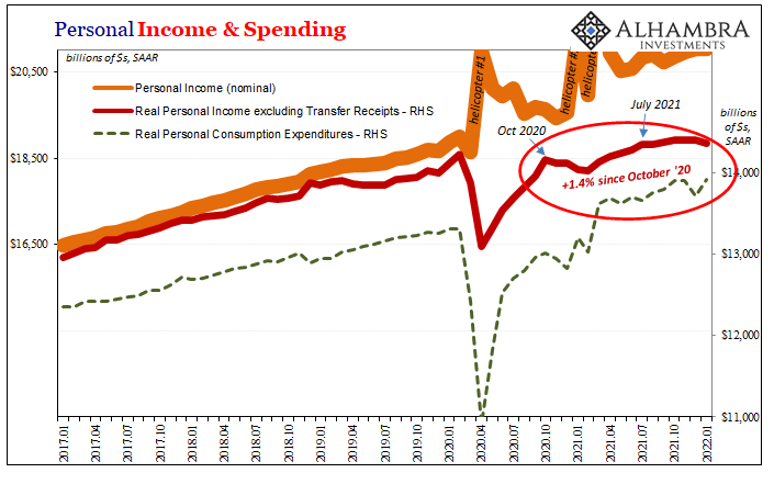
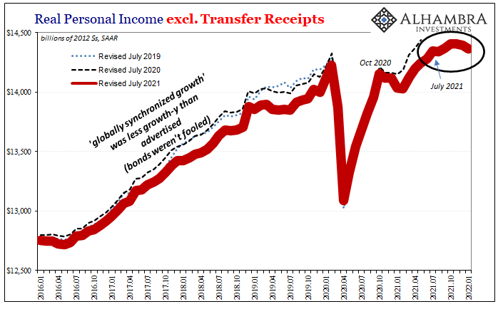
Of all the income data which the BEA puts out, it’s Real Personal Income excluding Transfer Receipts (RPIxXR) you need to pay closest attention for what should be obvious reasons (including the pretty solid and obvious correlation between the last of the two charts immediately below):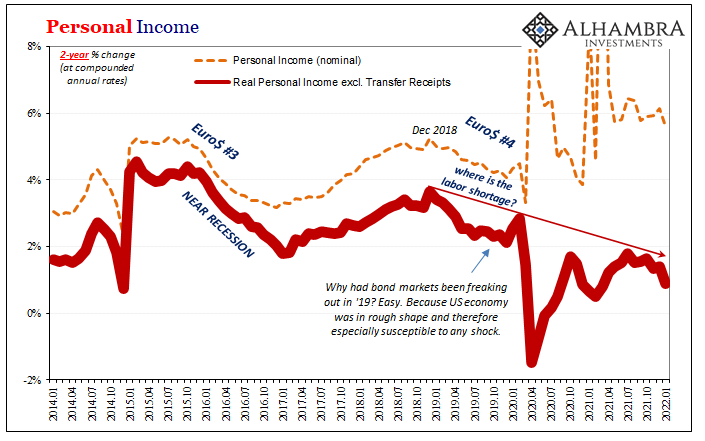
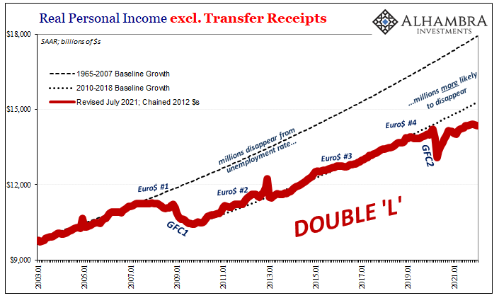
 American workers are not keeping up with the supply-squeezed price increases, at least not from earned income in the real private economy. Total pay to all workers (as well as income derived from business profits) has barely changed since October 2020 when you adjust for price changes.
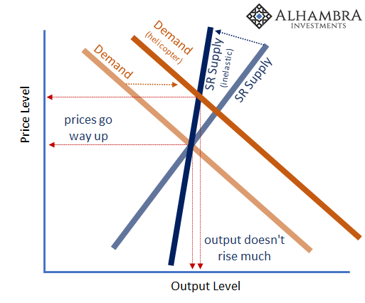
Those changes have been due to the temporary (see: below) helicopter shift of the demand curve to the right combined with inelastic supply (which includes the transport of goods) being inelastic at exactly the worst time. Much of America’s employed have been able to navigate these cost increases, some thrived. Too many, however, cannot.
That’s what the RPIxXR figures show us. The numbers and proportion of workers suffering from low pay/hours alongside those still stuck without work or any hope to rejoin the labor market are way too high. The more consumer prices (“inflation”, not inflation) erode take-home pay as well as government transfers, the unhealthier the economic situation becomes.
The BEA also gives us a bit of bad news on the account of Uncle Sam, too. As the government’s stipends fade further and further into the rearview, without actual and sustained employment recovery, the lack of one means less artificial support and the more keenly aware those most dependent upon it become as it dwindles. 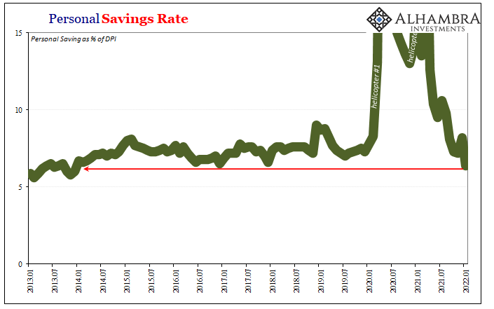 According to January’s Personal Income and Spending figures, the Personal Savings Rate dropped down to just 6.4% last month. The savings rate hadn’t been anywhere close to that low because of the government’s 2021 politically-inspired generosities. But now at 6.4%, this is the lowest savings rate in more than eight years, the last comparable going back to December 2013.
As one consequence, consumer spending is going to even more closely track (than it already has) the fundamental backdrop of earned income (as described by RPIxXR).
You’d think, given the narrative struck behind the Fed’s hawkishly aggressive rate posture, this low savings rate is because consumers can’t spend their newfound windfalls fast enough. They may be spending, but it’s all on price increases by this point.
In real terms, activity is actually abysmal. The misconception begins with the ongoing imbalance favoring goods over services, which, as 2022 begins, can’t just be attributed to pandemic impositions. Americans fell in love with especially durable goods, and keep buying them though prices for them have gone way up.
But at the expense of services.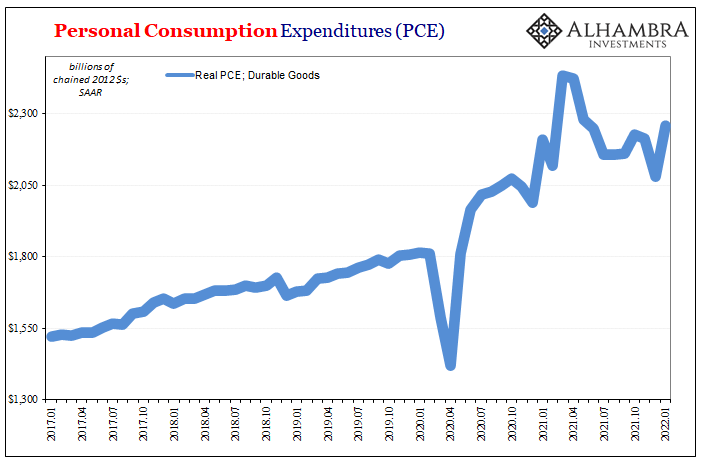
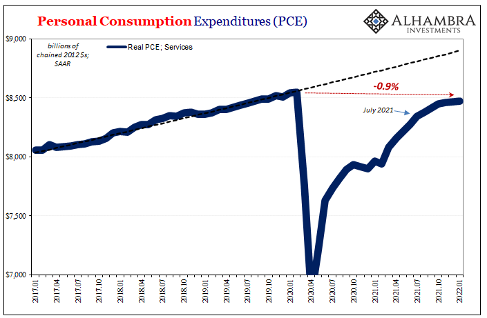
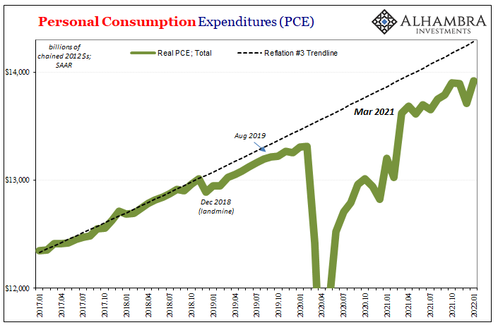
Total consumer spending remains substantially less than its pre-2020 trend, a baseline which wasn’t all that hot to begin with. The primary reason is that spending on services isn’t even back to the level it had been in February 2020, therefore the surge in goods only partly offset this far greater, wholly unappreciated services deficit. No wonder the economy remains millions of jobs behind, too.
All eyes have been drawn exclusively to goods, zero awareness for services or even the relative situation for total spending. Remember, this data is for January 2022; two years and still this much harmed.
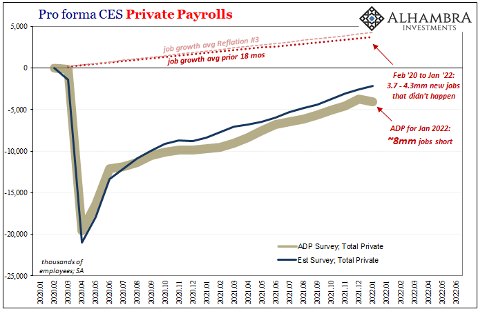
What should be most alarming to the Economists at the Fed is how this can possibly be the macro case given all the government (fiscal; “monetary” QE was irrelevant the whole time) pumped into the US end of the global economy over those twenty-three months.
Two-plus trillion from Uncle Sam, and this is the economy?
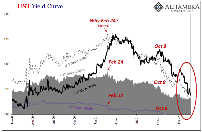
More and more, throughout the latter half of last year, the real economic situation began to emerge from the shroud of the price illusion (if it was a money illusion, it’d really be inflationary). Because of the supply shock and its effect on consumer and producer prices, egged on by all the “right” people, the public was left with the impression of some money-saturated, superheated powerhouse badly in need of a frigid, Fed-loaded dousing when underlying the whole time was an even more reduced potential than the already-substandard potential from before COVID.
Unlike the financial media, the bond market was not fooled. And if wasn’t misled last year about last year, what might its various ugly and uglier shapes so far this year indicate for the rest of this year (and beyond)?
Most probable is far fewer rate hikes than an on-fire inflationary inferno would legitimately require. As a start. 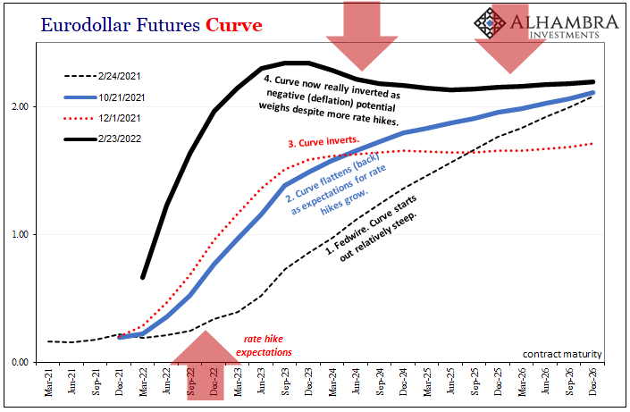
Stay In Touch